- [email protected]
- Fayetteville, Georgia
- Taming the Digital Beast -
Digital Printing in Color
CMYK - The Real Cure for PMS
I’m going to assume that you know the difference between RGB and CMYK. If not check out those articles in the Freebies menu. This article is all about CMYK, Spot Colors and how to design your graphic files so that your final printed pieces will look as close to what you intended as possible.
Traditional publishers generally use offset printing to produce their picture books. Print-on-demand books and self-publishing companies will likely be using digital printing. Except for a few tweaks to the final productionready files to be submitted to the printer, art designed for offset or digital printing will be designed and laid out the same way. Offset printing is generally very high quality. On digital equipment you can expect a bit of a color shift from the original art. It will not usually be so extreme to make a real difference, but as much as possible, let’s eliminate serious color shifts from ever happening to begin with.
One of the popular self-help quotes says to “begin with the end in mind”. If you are laying out a picture book or designing your marketing materials, a little bit of knowledge up front about color and how a digital press will interpret your files will ensure that the final printed product will look like you intended. So let’s “design with the end in mind”, saving you and your printer some big headaches and ensuring that the final printed product will look as close to the original as we can make it!
It’s that old “an ounce of prevention will save a pound of cure” thing ... kind of like, it’s easier to not gain 20 pounds, than to get 20 pounds off that body after it’s there! Yeah, I know ... sorry!
A Brief History of Color Printing
Before computers and digital printing, offset printing was the only option ... well, except for letterpress and lithography, which are more like art than printing. But that’s another article for another day!
Unlike a digital press, which is just a button-click away from beautiful full-color printing, an offset press requires manually filling an inkwell with ink, keeping it filled as the press prints, and manually removing leftover ink and cleaning up the inkwell after the printing is complete. That’s in addition to attaching the printing plate, aligning and registering everything, adjusting grippers, adjusting for size and thickness of paper ... it’s all very hands-on.
An offset press can have one “head” or many, meaning you can print one color at a time (one head), or maybe it will have four or more (multiple heads). If you are printing four-color process on a one-head press, you will have to print the full run of cyan. Wash up the ink, change and register the magenta plate and ink, then run the full run of magenta, then wash-up and change for the yellow, etc. On a four-head machine, you could run all four colors, cyan, magenta, yellow and black, and have the finished printed full color piece complete in one pass through.
What if you just wanted a simple flyer in one color, say, red? Why print that with four plates, four colors, four set-ups, four clean-ups? Let’s just mix up a nice red color ink, run it on a one-head press. One plate, one set-up, one clean-up. Simple!
Six weeks later, that same customer wants some more flyers. But we didn’t mix up enough red ink for another run. We’ve got to mix up some more ink and it needs to match the first batch. Sometimes you can eyeball it and get the same color. Sometimes it’s trickier.
Perhaps you could just purchase a can of a pre-mixed red ink.
Red from Ink Company A may be darker or warmer than red from Ink Company B.
If you order from one, you’d better remember where you got it when you reorder next time.
Let’s suppose you have a company producing a product, and have manufacturing plants in Atlanta, Georgia and Chattanooga, Tennessee. Both plants are distributing your product all over the state and all over the country. You have a logo. You have a “look” to all of your advertising, packaging, employee uniforms, even the trucks that are carrying your product everywhere. When the Chattanooga plant orders printing, or has your logo placed on the side of a delivery truck, you want it to look exactly like the printing and the trucks that are at the Atlanta branch of your company. It also means that screen printed graphics on the vehicles need to match embroidered logos on clothing and offset printed labels. And what will happen when you expand your company world wide? Will your product sitting on a shelf with your logo on the label from the Atlanta plant, look exactly like your product sitting beside it with your logo on the label from the new plant in New York? Or London, England? No matter where the printing is done, it needs to be consistent. Today we call it “branding”.
Enter Pantone LLC
I don’t know the exact history or time line of it all, but in the early 60’s the folks at Pantone – which started out as a printing company in New Jersey, if I understand correctly – came up with an industry-wide standard for color mixing and matching. The Pantone Matching System – the PMS Color Guide. What began mostly as a uniform color-mixing standard for the printing industry, has since crossed over into other industries. When you tell a textile manufacturer or someone who makes ceramic tile, that you want a blue to match PMS 293, they will know the exact color you want. Now the drapes in the bedroom coordinate with the tile in the master bath!
You can also tell your printer in Atlanta you want your flyer printed in PMS 293. It will look exactly like the flyer you had printed in St. Louis which was printed in PMS 293.
Back to our company in Atlanta and Chattanooga, now expanded world wide ... have you ever heard of CocaCola Red? Next time you are at a local flea market or antique show, seek out the inevitable collector of all things Coke. Trays, fabrics and clothing, toys, printed bottles, labels, crates ... items that originated from anywhere and everywhere ... all matching in the same Coca-Cola Red! Which pre-dates the PMS Guide, but it’s the same idea!
Spot Colors – Great for Offset. Digital, Not So Much
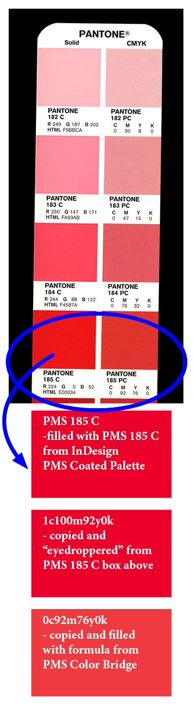
Spot colors in offset are no biggie. Just open a can of your favorite PMS color, fill up that inkwell and run it. You really don’t even have to purchase that special can of ink. If you have cans of cyan, magenta, yellow and black, and an accurate way to measure (or a very good eye for color mixing!), you can mix up the color you want by using the color formula printed on the PMS Guide. For instance, the printed formula for PMS 185 is 0c92m76y0k.
On a digital press that color will have to be built with the four process colors. The file you send to the printer from your computer will have the information the digital press needs to know: how much toner from each cartridge to put on the paper. If you send a graphic over with a color named PMS 185 – or, heaven forbid, an RGB mix (stop that NOW, people!) – the machine will not understand that and for all intents and purposes will make an “educated guess”. You might get the red you want, maybe not. So let’s send over our graphic filled with a color named 0c92m76y0k. Now we’re communicating! The press knows exactly what to do: 0% cyan, 92% magenta, 76% yellow, and 0% black will go down on the paper. And, no, I am not a technician, so I’m not sure if those should be “parts” or “percentages”, but the file and the press are talking nonetheless! And that’s what we want!
The other problem you will encounter is your monitor. The colors you see on the screen are probably not going to perfectly match the colors on the printed paper. There was a time when the colors on your monitor could be pretty well calibrated to match your printer. I was never able to master that, but I’ve worked in offset shops where they had done it perfectly. It was great for design work and matching colors to previous print runs. Today we have all kinds of different types and sizes of screens. Plus, most of those screens are now HD enhanced, which means incredible, vivid color. Terrific for watching movies and web design, but the vibrant images you create and see on your monitor can be disappointing when they’re printed out on paper.
Meet Your New Best Friend - the PMS Color Bridge
If you have ever been in an offset print shop, you have likely seen a PMS Guide. The PMS Guide has 2 sections: the Coated section and the Uncoated section. The Coated (ex.: PMS 185 C) section shows you what a PMS color will look like, right out of the can, when it is printed on a coated or gloss paper. The Uncoated (ex.: PMS 185 U) section shows you what that color will look like when printed right out of the can on a matte or uncoated paper. The Coated version generally is more vibrant because the ink sits on top of the smooth paper and coating. The Uncoated version will generally be duller and flatter because the ink will absorb into the paper. When creating picture books, the pictures will make or break it, so you want the images to be as vibrant as possible. Coated or gloss papers are typically more pricey that standard matte paper. But if you can possibly afford it, go with the smoothest coated or gloss paper you can get for your inside pages.
The PMS Color Bridge is a little different from the standard guide. Just like the standard guide, there are Coated and Uncoated sections. In each section, for each PMS color, the left side shows a swatch of color right out of the can. On the right side is the same color built with cmyk, which is what the digital press is going to do to your colorful illustrations. Just like the vivid image on your HD monitor is disappointing when printed on paper, a PMS color printed in cmyk can be a big let down.
But the Bridge can be very useful. Because now you know what to expect and can plan around it a bit. Every shop and press is a little different, so you will not get perfect results in every case. But no matter what you see on your monitor, if you use the formulas from the Bridge, you should get consistent results off the press. If a color you’ve chosen looks too off in the Bridge, go up or down a few colors and try another formula. Or play with the relative proportions of the cmyk formula you’ve got and see if you can get something better. When you get the colors you want, you will have the formulas and can use them throughout your book. The red typed copy on page 8 will be the same color as the red typed copy on page 17. And when you have another run of books, even if another print shop is used, you will have the best chance you can get of having the second run look like the first. I can’t guarantee no color shift at all, but it shouldn’t be too much.
Now having said all that, the Bridge and even the regular Guide can be a bit pricey. Plus it is recommended that you replace it at least yearly, because of fading and such, and the color samples won’t be accurate when that happens. I keep my Bridge closed up in the box it came in and stuffed away in a closed drawer or a dark closet when I’m not using it.
I wanted to bring it up, because discovering the PMS Bridge for me was one of those light-bulb moments ... oh! THAT’S WHY! I knew to convert images to cmyk, and would have occasional dull, drab print outs of bright beautiful images. When I saw a PMS Bridge, with the bright PMS color on one side, and the duller cmyk-built image sitting beside it, I understood what was happening. And that’s what digital equipment is doing to your art: building the colors out of cmyk.
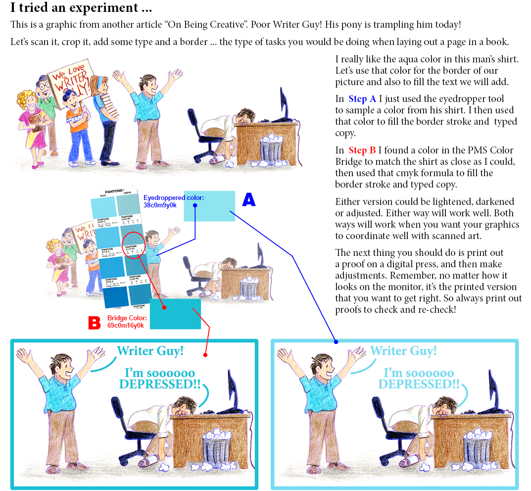
So, Now Meet Your Other Best Friend - the Eyedropper Tool
I love my Bridge and refer to it often. It’s helpful when trying to match a color that’s in the real world and not inside your computer. Match up the color, and then you will have a formula to use in your graphics program. It may need a bit of tweaking, but the printed color will be pretty darn close to the real world color you were matching. But if everything you are trying to match is scanned and inside the computer, all you’ll need is the eyedropper tool in your graphics program.
Always, always print out a color proof of your book before sending the production files to your publisher/ printer. Any adjustments you need to make will likely jump out at you. Save these color printouts and compare them to the finished book when you get your copies. You will understand all of this better and have a clearer understanding of what you need to do on future projects.
Not Just Black – Make It BLACK!!
If you are the illustrator reading this, you have likely had the unhappy experience when painting or drawing, of pulling out your black to use on a piece and having it look a bit dull or flat on your art. You’ve probably learned, as I have, that a mixed black is much richer than straight black out of a tube or off a pencil. Use this same principle in your graphic art that will be digitally reproduced.
Seeing is believing ... try this experiment:
Scan a nice colorful piece of your art. Lay it out on a page with a nice title in black ink. Or maybe pull a page out your current project. You want a colorful image and a typed header and/or some body copy. Fill the type with just plain process black. Your formula will be 0c0m0y100k.
Now duplicate your page. On the duplicate, fill the type with this formula: 60c40m40y100k.
Just ‘cause we can, duplicate the page again. This time fill the type with 100c100m100y100k.
Label your pages 1, 2, 3 so you’ll know which is which. Now print out color, digital copies of each page and compare the blacks. The difference will amaze you.
I mostly use one of the last two formulas when filling type or graphics with black. But here’s a heads up: when submitting your print files to your publisher/printer, please, please pay attention to their guidelines. I submit to one publisher fairly often, and they always encourage the 60c40m40y100k formula for black. Another publisher I worked with said under no circumstances whatsoever should any files ever be sent with anything other than 0c0m0y100k! So always pay attention and send what’s needed!
And heads up ... if you’re printing a flyer or something in grayscale, and expect to be printing and paying for a one-color job, either print on a black and white press, which will give you a good, dark black, or go with the 0c0m0y100k formula if printing on a color machine. If you go with the richer black formulas the equipment will be pulling from all four cartridges and your one-color flyer is now four-color process!
The Paper for Great Color
I’ve already mentioned the advantage of gloss or coated papers to keep your colorful illustrations vibrant. These papers are usually more opaque, even when fairly thin. You really don’t want to be able to see images from the other side of a page when reading a book. If cost is an issue and you really must use a matte paper, make certain it has some body to it and is opaque enough to prevent bleed-through.
Some high end digital presses are equipped with optional enhancement settings, which actually lays down a clear coating over the areas of the paper where the image is printed, making colors more vivid even on matte papers. It works exceptionally well on gloss papers. Not all print shops will have equipment with this feature. If you are the one contacting and working directly with the printer, ask about this availability and the added cost. If your publisher is in charge of contacting and working with the printer, you may not have the option or opportunity to ask.
- Beware the Grays -
The Business Card From Hell
Once in a digital shop where I worked, we had a problem crop up that, to this day, I do not know a solution. But maybe it’s something we all need to be aware of when we are designing art that will be digitally printed. Or maybe there’s a genius out there reading this that can shoot me an email and ‘splain it to me ... please!
We had a client, a newly formed software/computer/web designing company. Really great guys, terrific graphic designers. One of them designed their company logo and business card (which we would be printing) and it was beautiful: the background had a kind of abstract, gray, silvery, shimmery, machiney/ technical look to it. On top of that, the logo and person’s name were in a velvety violet blue. Other copy, like address, phone, etc., was in a very dark gray. Of course, these were web guys, and the whole thing was laid out in RGB in Photoshop. But we were really, really good printers and knew what to do: convert that art to cmyk, save them as PDFs so we could run them multiple-up ... that’s why you hire professionals! We printed them on heavy gloss stock. They were beautiful!
A few months later and the new company is growing. They have a new employee who needs business cards. No problem! Pull up the original files, make a duplicate, re-type the name and other modified info and hit print! Nothing’s changed except the re-typing. Same files, same software, same high end digital press ... but the cards look off. Our gray, silvery background now has kind of a purple cast. Let’s adjust the color levels ... now it’s a pink cast ... let’s adjust the settings on the press (which we had never adjusted before, EVER!!) ... now it’s blue! Every single time we ever tried to print these cards, they would come out different. We even tried printing in rgb mode. I tried to fix it. My boss tried to fix it. We hired another graphics person with more experience to look at it. We sent the job to other vendors instead of printing them in-house. If we got a batch that looked good, the next batch a few months later, wouldn’t look the same. Aaaarrrgh!!!
Of course, the whole problem is that on a cmyk machine, you are building gray: a tiny bit of cyan, a tiny bit of magenta, a tiny bit of yellow, a tiny bit of black. If you have flat color on a vector image, like in clip art for instance, you can assign a gray color to it, and give the printer the correct formula to print: 26c22m22y0k. You will get a nice gray. But what if your image is a raster image with highlights and darks and subtle shading? The only way to get a true, consistent gray every time is to just convert the background image to grayscale, or turn off the cyan, magenta and yellow channels on that image, so only the black ink will print. A grayscale image with only black ink will likely be a bit crisper. This works great for black and white photos that are sitting beside color graphics, like on a brochure or magazine. But for graphics, straight black can also look a little dead and flat. For our web guys, to get the soft, silvery, shimmery effect on the background graphic – with just the slightest hint of color – it had to be built with the other colors however subtle. And I suppose that was the problem, that the color mixtures were just too subtle for the machines to handle. What we didn’t understand was why the results weren’t consistent, even if they were off a bit. Seems like if nothing changed, at least they would still be off the same amount every time. But, like a co-worker used to say, there you go trying to be logical again!
If you have art that gets printed digitally and you need reprints occasionally, you can get slight color shifts from batch to batch, even when each batch is printed on the same equipment, same paper, same files, etc. So please be aware of that in situations that require more consistency.
For a real-life example of a color shift on a reprint of a digital job, see my blog from July 3, 2019.