Many great ideas have originated from scribbles on a napkin during lunch ...
This is not one of them.
Because, 1. it's not lunch time, and, 2. it wasn't done on a napkin.
However, it IS a scribble ...
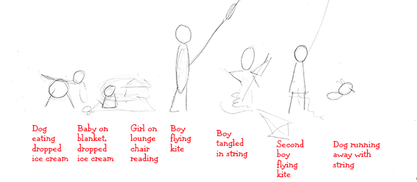
I want to show you the value of those unassuming little stick figures, so we'll take a look at the whole process, from concept to finished illustration. The scribble is where it begins ... getting a thought down on paper. If you don't have a napkin, a nice sheet of bond or tracing paper will work.
I'm working on this in March, so let's do a kite-flying scene with several different figures engaged in that activity.
This little scene would make a nice 2-page spread for a book. I'm going to use it for a homepage on the website.
My original thought for the girl in the lounge chair was to be looking straight on at her. You'd mostly just see her lower front legs, the back of her book and maybe the top of her head peeking over the book.
Be glad I had the foresight to type my notes. My sketch honestly looked more scribblely (is that a word?) with my handwritten notes, but I thought perhaps readable should trump scribblely (no, I'm pretty sure that's not a word!).
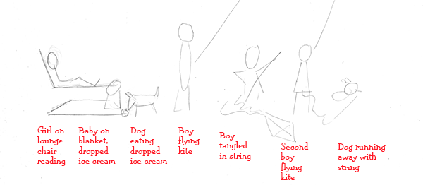
I didn't like the baby turned to the left and looking down at the dog. It's a poor layout decision, because it causes the viewer's eye to keep going left and out of the scene.
So I flipped them ... now the baby is looking down and to the right into the scene. The dog is looking left now, but it doesn't matter, because he's in the scene and not at the ending edge.
I also turned the girl in the lounge to a side view and put her at the left edge. She and the baby are both now facing into the scene.
An added bonus is the upright back of the lounge chair, which "closes" off the left edge and will make the viewer's eye turn back into the scene.
Good layout keeps the viewer's attention in the scene, and will actually make their eye/attention "travel" through the scene.
The little dog running away at the right end is running out of the scene. This works on that end, because it "opens" the right edge and suggests that there's more to come ... this is a great layout trick for books, because it tells the reader to turn that page!
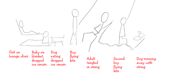
Another tiny tweak ... let's make the boy who's tangled up in the string an adult, or maybe an older brother. Let's get some variety in our picture.
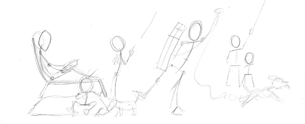
And here come the stick figures. This is where you work out proportions of the different figures in relation to one another. You don't want a baby that's too big to fit in someone's lap. Or young boys who are larger than their older brothers.
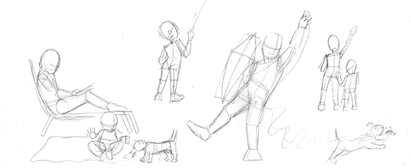
If this was an illustration for a book, I'd leave them all together, but it's going on my website homepage, so I pulled the first boy away. I need separate images that can slide around to accommodate different screen sizes on phones and computers.
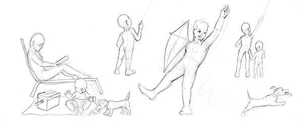
A few more tweaks ... can't read in the park without a cooler full of drinks. And don't forget your phone. Big brother looks like he's got a boy's face and a man's body! Every step reveals needed fixes.
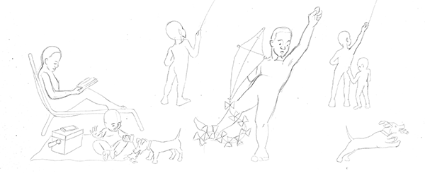
Here's my "naked bodies" step! I don't like this step, 'cause I'm a bit of a prude ...
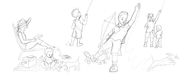
... but it's needed to clothe these guys. When you can see the form underneath, you can easily wrap collars, drape sleeves and hems, and top their heads with hats that sit correctly.
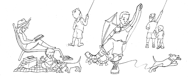
And here's the final cleaned-up drawing ready for some color. I'll put some grass under their feet ... a gorgeous day for kite flying!
When it's got some color, let's also add a whole background with sky and ground. Here I used a background from some of my website graphics from a couple of years ago. Distant trees will help give the illusion they are in a big, open field ... perfect for flying kites.
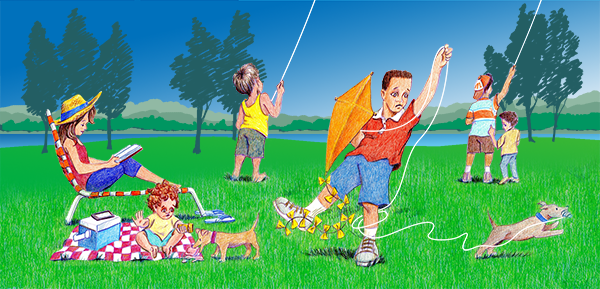
And here's our finished art ... but I didn't do it right ... The Meek and the Mighty articles were all about stick figures. That's what I want on the homepage, not finished drawings.
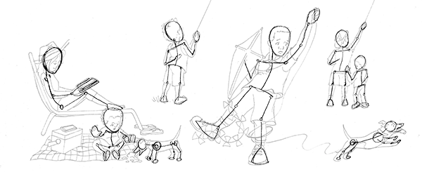
So back to the drawing board I go. I'll use the drawing I have to layout these special stick figures. They need to be a little fancier than usual to appear on the homepage.
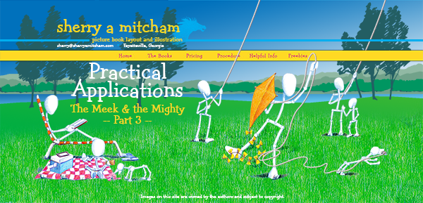
I supppose they're a little strange, more like pipe people than stick figures! But that's the fun of experimenting. When experimenting, sometimes the results are odd, sometimes terrific. But always you will learn something, and probably will have lots of fun learning it!
Next time someone's enjoying your art, and they make that off-handed remark about "all they can draw is stick figures", you tell them to have a little more respect ... if they can draw stick figures, they are well on their way to being great artists!