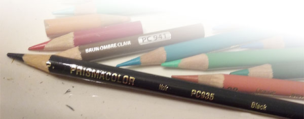
I have been working with colored pencils now for over 15 years. Probably pushing 20. I love my pencils! I’ve got pieces and tiny stubs that date back to the first set I bought. How can we part? We’ve been through so much together! Thank you, Lord, for pencil extenders!
But see the photo of the black pencil above? It’s probably not the very first black pencil I bought. But I wouldn’t be surprised if it was only the second or the third!
Poor neglected pencil! And here’s why:
Years before I discovered Prismacolors, when I was still working with pen and ink and watercolor, I loved taking classes in the evenings to learn more. Two of those classes were at a local state college back in the late 1980’s. The teacher was a lady named Lydia.
The first class was a watercolor class, and she really challenged us: we were going to paint our choice of subject, but only using the three primary colors, red, yellow, blue. No brown, no black, no pre-mixed secondary colors like orange or green, no special pre-mixed any color. Any color we needed had to be mixed either in our palettes or with water on the paper. I learned more about color doing this one exercise than any other thing I had ever read, heard or tried. It totally changed the way I worked. That’s probably why, out of all the art classes I ever took, the two I took from this wonderful lady are the only two I can remember to tell about!
The second class I took from Lydia was an oil painting class. It would be the same, no colors, just the three primaries plus white, since it was oil. But this time, instead of copying something from a magazine or photo, we would copy an old master.
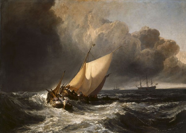
Oh, great! Just what I wanted ... I’ll either end up with a fat naked lady or fat, flying babies with wings ... oh, well, it can live in the closet when I’m done! Off to the library to find my old master porn to copy! I truly was not thrilled (and not very cultured, apparently!). But at the library – and it surely was one of those God moments – I found the book: J.M.W. Turner, A Wonderful Range of Mind by John Gage. Oh, boy!! Here was an artist who knew how to ride his pony! And, wow! Look at where his pony took him! Not truly an old master – Turner lived in the 1800’s – but way, way ahead of his time. I call Turner the painter of light and emotion. Brilliant, brilliant artist. You don’t look at a Turner. You experience a Turner!
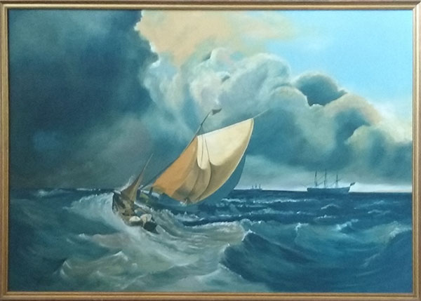
I don’t know how long I stayed in the library that day. I know the book came home with me. I soon thereafter purchased my own copy ... because there it was, on page 111: “Dutch Boats in a Gale: Fisherman Endeavouring to Put their Fish on Board”. No fat, naked, flying anythings! And it hangs in our living room today. My pitiful version is entirely too blue, the colors too cool. I thought it was pretty good, until now when I have them side-by-side. Yikes! Turner is probably spinning in his grave! But it was a grand learning experience, done entirely with just the three primary colors and white. So just chalk it up to student work.
A Turner and a Mitcham
Well! This is embarrassing. You would think I hadn't even seen the original!
I got the first image off www.william-turner.org and it's the first time ever I've had his and mine side-by-side. Kinda' wish I hadn't done it now!
In my defense, I will say that I painted this 30 years ago. I see and approach color much differently today. And I was painting from a picture in a book which had more gray/marine green tones. I purposely made mine more blue, because I wanted to hang it in our living room, where it's been for these 3 decades. I'm sure my version also has some fading due to the sun marching up the wall every afternoon ...
Enough of the lame excuses! At least it's not a fat, naked lady!
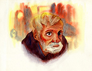
At left is the old man I painted in the watercolor class. I got him out of a magazine, a NatGeo, I think.
Good grief! First Chaplin, now these!
Hope you guys will come visit me in copyright jail!
But, hey - I'll have plenty of time to re-paint my Turner knock-off!
Why such a limited palette?
Straight from Lydia’s mouth to your ears: because it will pull your painting together and make it more unified!
More than just learning how to mix the colors correctly – which is certainly a valuable skill – if you are mixing your colors from the same palette, they will always be similar, like they came out of the same family. If you get the right mixture for a particular color and need a darker value, you will be using the same colors to darken that were used to mix the original color. The two colors together on your canvas will be totally compatible and pull the piece together nicely. If you have a color and need a darker value, and just throw in some black from a tube, or even a darker shade of red or blue that were not in the original palette, you have now changed the hue. It’s not the same color anymore, and will possibly look okay, but won’t have the same unifying effect.
If I remember right, before we began painting, Lydia had us mix up the base color we wanted to use. Then a darker value and then a lighter value of the same color. Even though my version doesn’t exactly match the Turner, just viewing it by itself, it works and it stands on its own. (Note to self: leave the book unopened on the book shelf when we have visitors!)
We were using just the primaries, because she was also teaching us how to mix colors. But a limited palette doesn’t necessarily mean just the three primaries. However many or whichever colors you use to mix, just use the same colors for the whole painting.
So Why No Black?
Because just straight black will sometimes just look flat and dead on your paper or canvas. It can actually take a vibrant color nearby down a notch or two. You don’t want to be pulling vibrancy out of your art!
By the way, if I were to really explain it correctly, it’s because in the real world we see color based on which spectrums are reflected back into our eyes when we look at something. There probably are no actual instances (or very few instances) where we see pure white or pure black in real life: where either absolutely all or absolutely none of the spectrums are reflected back to our eyes. But I’ll leave that explanation to real scientists!
So instead of straight black, let’s mix it up and get warm, dark blacks with red and orange undertones. That‘s what I got in the watercolor of the old man above using only the three primary colors. Or cool down with steely cold blacks with blue, green or purple undertones. It will depend on what your piece calls for. I don’t know how these samples will look on computer and phone screens. Black in RGB always looks very black. You may have to get out your paper or canvas and whatever medium you work in and just try it out! Colored pencil is a bit like watercolor in that it is transparent. Whatever is underneath shows through.
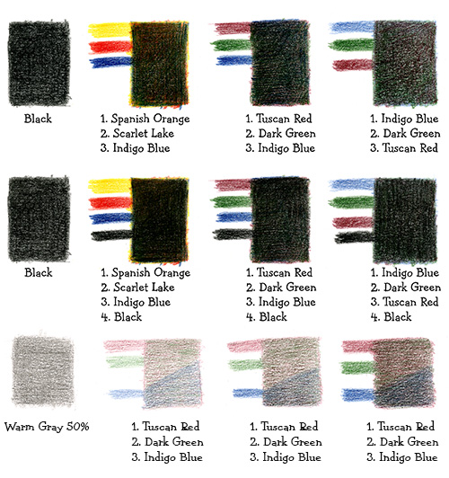
The top row in the sample above shows straight black, then 3 samples of mixed blacks. The numbers show which color went down first, second, etc. If it will show on your screen or monitor, notice how much warmer the black is made with the 3 primaries, than with the 3 darker shades of red, green and blue. (Someone was riding their pony the day they were naming colors at Prismacolor! Spanish Orange looks yellow to me!)
Also with the pencils you can get warmer or cooler shades of black by reversing or mixing up the order of the colors you put down.
Sometimes you still want it to be very black, so do use your black, but over the other colors. It will still be richer than black alone, and you will have a more natural looking black, and not a flat, deadening black.
You can use these same recipes for grays, too. Just lay down lighter layers of the same colors you used for black. Even your grays will look richer than just a straight gray off a pencil or out of a tube. Here I used the same colors to produce gray as I did to produce black. But you can experiment using any complimentary color combination you wish. For lighter or darker values, simply use lighter or darker values of color. The best grays will come from using complimentary colors, red/green, blue/orange, yellow/purple, etc. On these samples, I added the Indigo Blue at the very bottom, so you can see that the Tuscan Red and the Dark Green made nice grays without the blue added.
You can check out samples of my book illustrations in The Books section of this site. Below are samples of my early colored pencil work. These are pre-book illustration days. All are done with no black pencil at all!
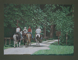
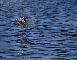
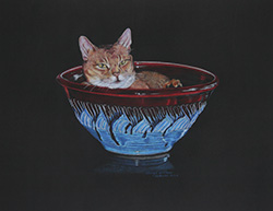
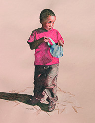
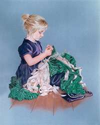
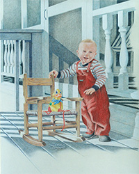
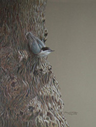 Out For A Ride • Solitude • Newman • Israel • Kara • Caleb • Nuthatch
The drawing of the cat, Newman, was done on black colored paper. There is pencil on the dark areas of the bowl – very deep dark reds like the top rim. I didn’t just leave paper showing through. I did leave the toned paper showing through on the black background, and also on the toned backgrounds of Israel, the Nuthatch and Kara.
I always wanted to work on toned paper in color. The colored pencils allowed me to do that! I love my pencils!! (Did I already say that?)