I'm still reeling from the shock ...
... a shock on the order of maybe in your 60's finding out from your mom on her deathbed that she and your dad are not really your parents, that you were in fact adopted, and you have siblings elsewhere, but before you can get any more info, she passes away ... wait, WHAT??!!
Well, okay ... maybe it wasn't THAT traumatic ... but it was pretty darn close to THAT traumatic!
From the time a kid can wield a crayon in those first years of grammar school, he will be taught that a primary color is a color that cannot be mixed using any other colors.
That is true.
Then the truth gets followed up with a lie ...
I wanted to compare it to the new math, but the new math isn't really a lie, it's just very convoluted truth. If you live your life operating with new math, life will work, but it will get very complicated very fast and soon you will be switching back to the original, less complicated way of figuring out budgets and restaurant tips and how much paint to buy to freshen up the living room.
No, the lie I'm about to expose is much more insidious than that. A person can live their whole life, raise a family, work at their career, pursue their passions, and one day die and fade away ... all while believing this one little lie. Even artists – who will be basing their work on this lie on a daily basis – will rock on for years totally oblivious.
So, yes, I've believed this lie my whole life. And as an artist, I've always carried out my work based on this lie. I'm in my 60's, and while I'm not expecting any shocking news from my parents at this point (although, it would really explain A LOT!!), having this particular lie exposed has totally rocked my world!
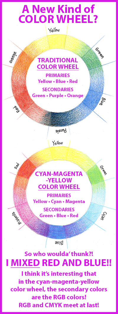
And here's the lie: Red, Blue and Yellow are the primary colors.
Let's see if that's so ...
There's a video on YouTube entitled This is not BLUE where Echo Gillette explains what the true primary colors are. And that red and blue are actually secondary colors, because they can each be mixed with two of the real primaries.
So I would invite you to check out her video where she demonstrates this, or else just read on and I'll show you myself ...
The TRUTH ... Hiding in Plain Sight!
In all my decades of working in the printing industry and with the cmyk colors I can remember moments when fleeting thoughts would pass through my mind, If red and blue are primary colors, how in the heck are we able to print them using cmyk? Hmmm ...
But I never pondered it too long, and never dug deeper for an explanation. I suppose I just figured that the pros knew more than me ... who was I to challenge a system that had been in place for eons before I ever appeared on the scene? At work in the print shops, it was cmyk. At home, when drawing or painting, I referenced the traditional color wheel I had always known. I keep several color wheels close by when I work and refer to them regularly for getting ideas for colors, finding complimentary colors, etc. And it has always worked quite well for me.
But now my beloved color wheel had been exposed as a charlatan! And, like a long-term relationship recently gone bad, I'm not emotionally ready to just toss it aside. On the other hand, how can I just continue to live with a known liar ... I can't just "un-know" this new information ... what to do?
In an attempt to understand, I made my own color wheels based on the traditional red-yellow-blue and the cyan-magenta-yellow colors. It was eye-opening, to say the least. And fueled me with some pretty good reasons to not just ditch an old friend ...
Here are my results:
This little experiment was very eye-opening ... did you see it?
When I saw it, I remembered what I forgot I had learned 30 years ago ... and AHA! All the lights flickered on!
It's that very nasty "purple" I got when I drew that top, traditional color wheel. Does this look like purple to you? (And, trust me, it's not your screen ... the original art looks just that bad!
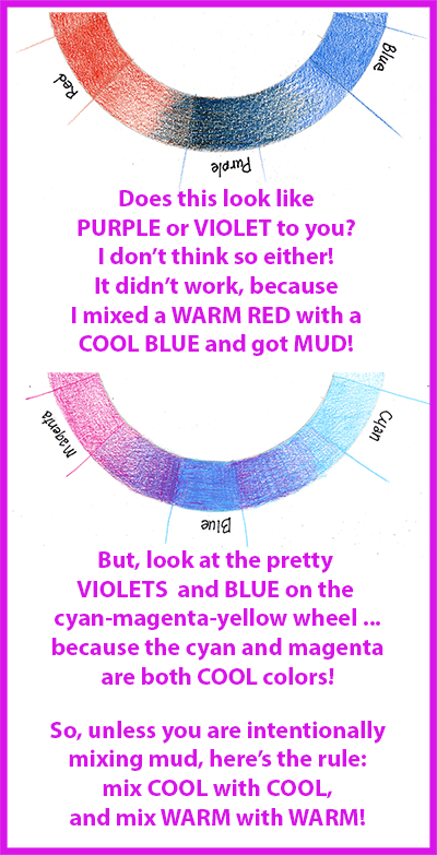
Back in the 80's, when I was working in watercolor and occasionally oil, there was always this annoying problem of being able to mix just the color I wanted. Other artists I talked to had the same problem. Red and blue make purple, right? Not always! Many times you just get a yucky shade of brown, gray or an almost black, just like what I got above.
Two events during this time helped me understand what was happening:
The first event was an oil painting class where the instructor had us mix all of the colors we needed for our painting using just the 3 traditional primary colors, red, blue and yellow. I wrote about this in my article The Loneliest Pencil.
The second event was getting my hands on the book, Blue and Yellow Don't Make Green, by Michael Wilcox.
This book helped me tremendously. Especially for all you painters out there, if you want a terrific study of color and mixing color, in any kind of medium, I highly recommend this book.
It's been sitting quietly on my bookshelf for years, and was the first thing that popped into my mind when I drew these wheels and got that nasty color trying to pass for purple on the traditional wheel.
It's because colors have "temperatures". They can be cold, cool, hot, or warm. And that's the basis in Mr. Wilcox' book. His basic color wheel has 6 primaries! It's still just 3, but each one has a range from a warm version to a cool version:
1. Red to Magenta
2. Blue to Cyan
3. Warm Yellow to Cool Yellow
If you want your color mixes to turn out correctly, always mix warm with warm and cool with cool. If you're getting a muddy mix, then you're probably mixing cool and warm colors.
But the REAL Dilema Is ...
What in the heck am I supposed to do with BLACK now?
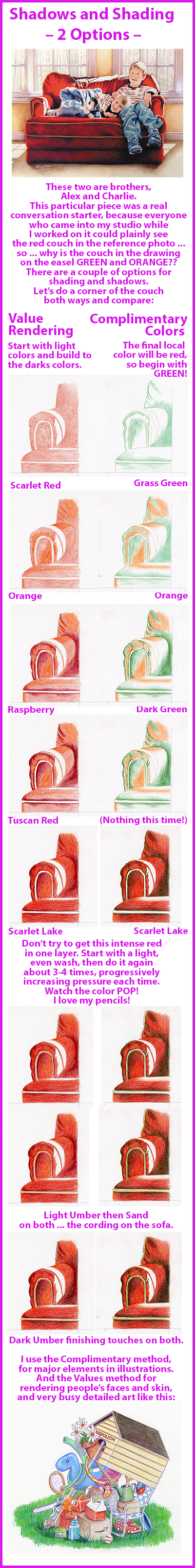
If you check out that article, The Loneliest Pencil, you'll know I like to use complimentary colors for deep rich shadows and blacks. Rarely do I use my black pencil. But complimentary colors on the Cyan-Magenta-Yellow Color Wheel are a problem ...
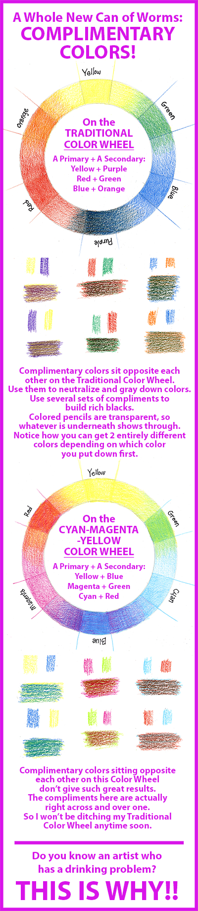
This is the reason why the printing industry had to add black. You can't get good darks just using cyan, magenta and yellow. Because they are all cool colors.
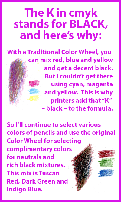
But I've always been able to get great darks based on the traditional color wheel, so I intend to just continue doing what I've been doing all along, though I will keep all this stewing in the back of my brain.
I strongly suspect that if we just stated the truth – the primary colors are cyan, magenta, and yellow – life would just go on as usual.
The real problem I'm having is how to arrange the wheel, because I depend on my color wheel to show me complimentary colors and that's not working well with the new model. But all my old thinking – based on lies! – seems to work just fine!
I'm so confused!! Is it any wonder that artists have a reputation of being a flighty bunch?
But not to worry ... it's gonna' be okay ... I have the perfect remedy for days like this when my brain's on fire ... and it doesn't involve pills or alcohol ...
All that's needed is a nice smooth sheet of 100 lb. bristol board and a handful of some unassuming pencils ... Let's DRAW!
Color + Pencil = Heart-Pounding JOY!!
And on the eighth day, God created colored pencils ... and it was GOOD!
I LOVE my pencils!
I get a bit carried away ... go get yourself some Prismacolors and you'll likely get carried away, too!
It's because of the color! The layers! The creaminess! The control! The convenience of a dry medium! The richness of oils! The clean, clear transparency of watercolor! And the COLOR!!
Did I say color yet?.... it's the COLOR!!!
Okay ... deep breath ... I will show you ...
If you'll click here you can see the progression of an actual project. For now, let me show you a little more close-up ...
If you decide to draw along with me, there are a few tips you'll need to know:
- Prismacolors are wax-based. Kind of like very high-quality crayons.
- I use 100 lb. smooth bristol board. If you use paper with more "tooth", the pencil will sit on top of the tooth and you'll have to use more pressure on the pencils to fill in and get more solid fills. But different art styles may look better on textured paper, so just experiment and see what you like best for your own style and techniques.
- Because Prismacolors are wax and not graphite, they don't smudge. Still, keep a piece of plain bond paper under your hand when working on a drawing. The oils from your hand will cause spots on your art paper or board where the pencil won't mark well. Kind of like trying to draw on wax paper with a crayon!
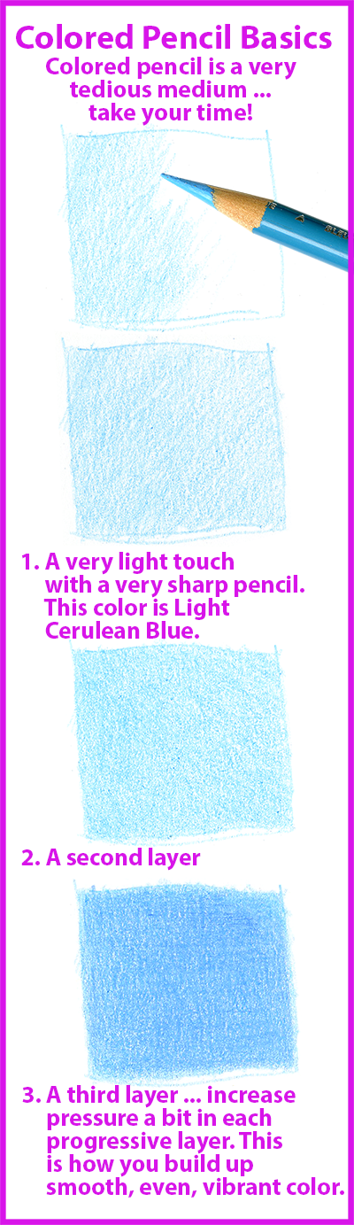
- Keep a really sharp point on the pencils. This is the number one secret to getting smooth, even fills, and it takes a good bit of practice to keep from breaking off that point. Don't get discouraged ... keep practicing! I have a fairly light touch naturally, and, even after years of using these pencils, I still struggle with this sometimes, but it will come if you just practice.
- About sharpeners, I've used all kinds, from electric to hand-held. My favorite is a hand-cranked X-acto brand that clamps via suction cup to my glass-topped light table. I would actually prefer a wall-mounted style, but with the X-acto sharpener sitting right beside me on my drawing table, I don't have to get up and cross the room. This is important because you will be sharpening your pencils a LOT!
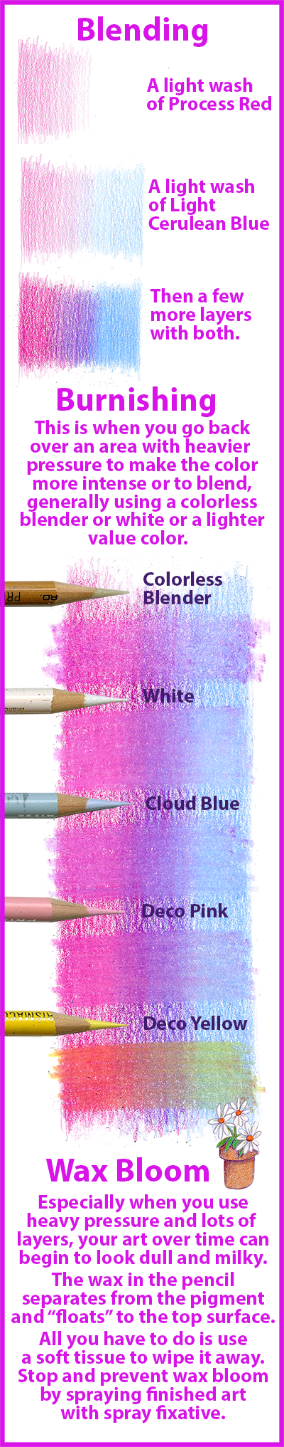
- Colored pencil is similar to watercolor in that it is transparent. Vibrancy, shading, and blending are built up in layers.
And A Personal Favorite Heart-Pounding Goody ...
Upon discovering the wonder that is a Prismacolor, one of the very first heart-pounding-look-what-my-pencils-will-let-me-do!! moments came when I found out I could work on colored paper.
Oh, boy!
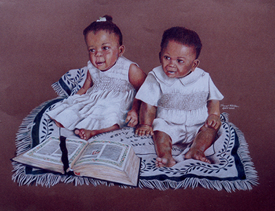
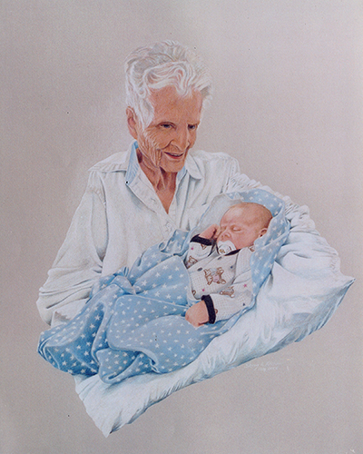
This was great for portraits, because I could use the paper color as a background without filling every inch with pencil. If you’ve ever worked with colored pencil, you understand! It is a tedious medium!
Colored paper and Prismacolors were made for each other! All the coloring tips in this article will work on colored paper, with just a few things to remember ...
The colors may be just a bit off because they are transparent. So the color of the paper will be a big influence on what you get. The colors won't look exactly like they do on white paper.
When you purchase paper, always purchase an extra sheet or two for experimenting. You will be so glad you did.
When you get your art sized and drawn, make a nice black outline of it on tracing paper. On another piece of tracing paper, cover it really good on one side with either black or white charcoal and use it to trace and transfer your drawing to the art paper. Especially on dark papers, the white charcoal works very well. It is a bit messy, but erases easily with a kneaded eraser when you're ready to clean up and erase the guidelines.
Get a white Verithin pencil. The Verithins are made by Prismacolor, but are much thinner and have harder lead than the regular Prismacolors. On very dark colored papers, use the Verithin to lay down a layer of white on the paper, and then work on top of that with the normal Prismacolors. It won't be as white as white paper of course, but it will give you a good base to work on. Colors like yellow will look much better on top of that.
The colored ground will make the pencil colors pop. Pick a color that coordinates well with your subject and incorporate it into the design.
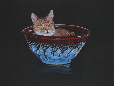
And a final tip for all you gallery-style artists who make reproductions of your work: colored pencil work makes terrific giclées.
A giclée is a reproduction which is printed on high quality art paper using a high-end ink jet printer.
I've only had a handful made of my own work over the years, but they have turned out terrific. The prints actually look better than the original art!
The cat, Newman, above is a prime example. Because the black on the print is actually blacker than the real paper of the original art, making the colors pop even more! So check that out if you are in the market for reproductions of your art.
Happy coloring!