Colors are the emotions of the physical world.
Like Dr. Frankenstein's monster who didn't live until that spark of electricity touched him, I always feel like my little pencil drawings spring to life when the spark of color hits them. It's my favorite part of what I do everyday ... coloring the drawings.
When I draw, arrange, layout, type, plan, design and write, I'm merely working.
But when the colored waxy pigment of a pencil gets rubbed onto a sheet of smooth bristol board, I'm an artist!
So I thought you'd enjoy seeing the stages of a drawing springing to life ... let's color!
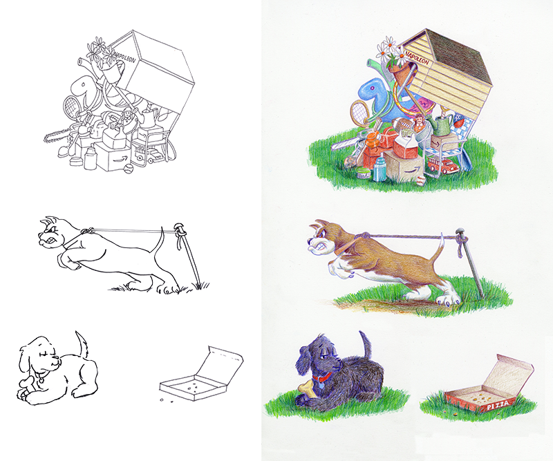
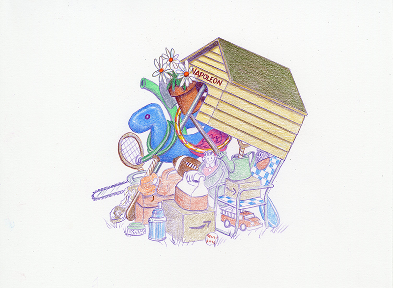
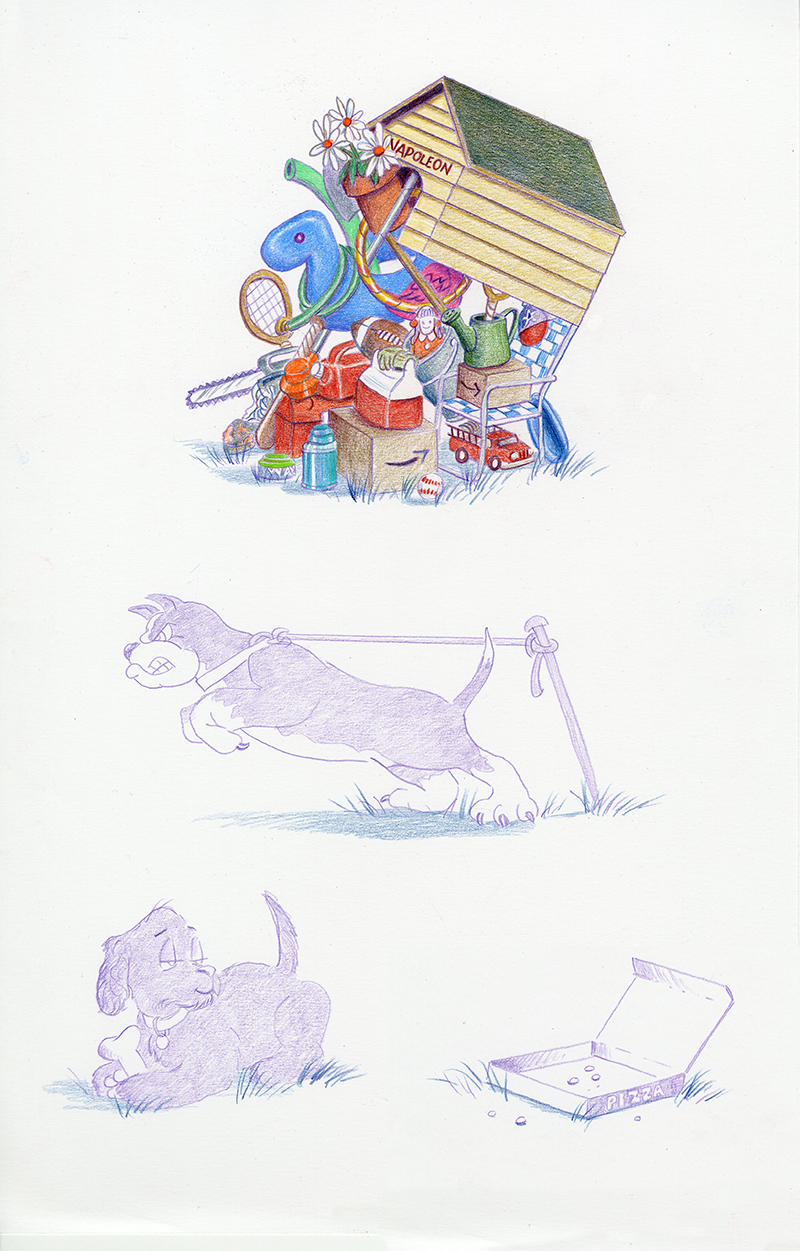
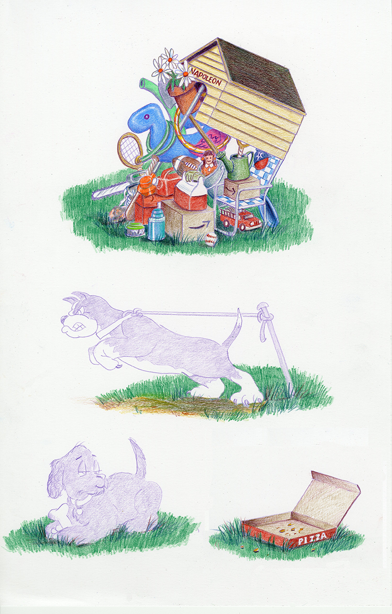
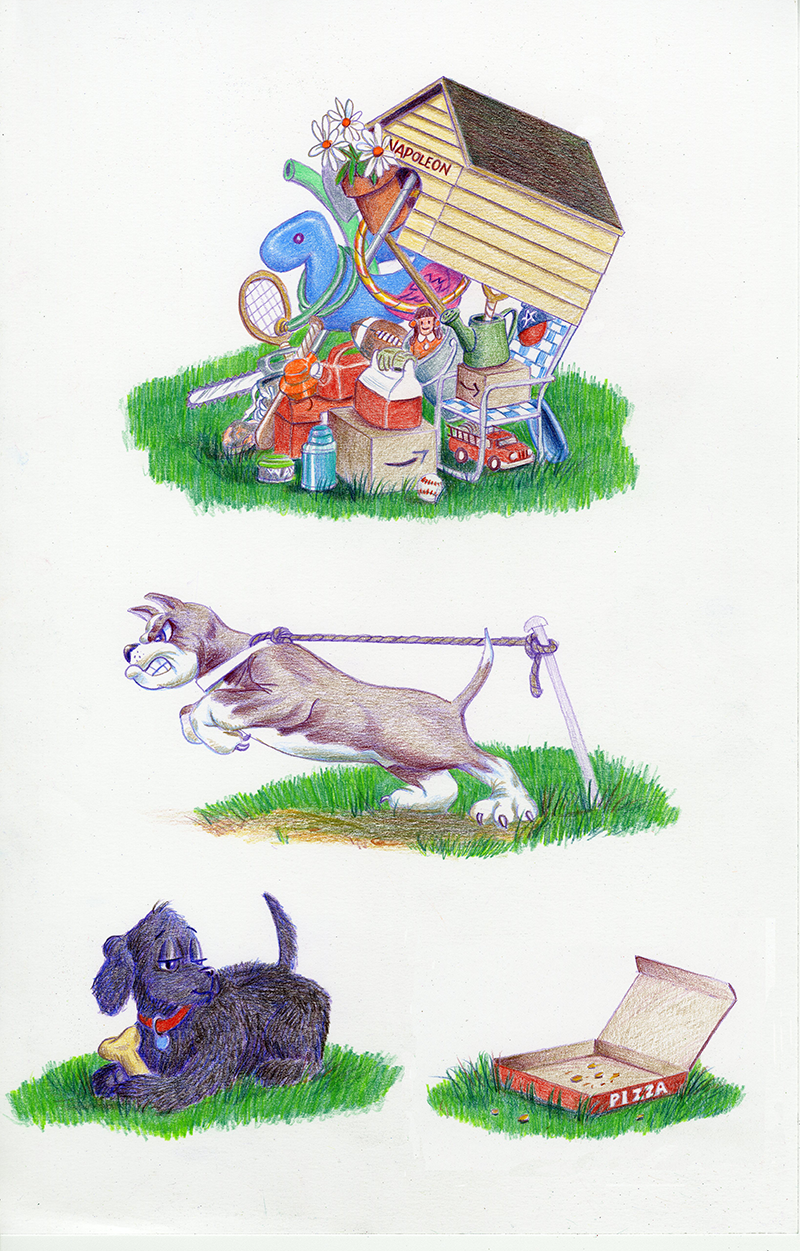
Do you remember these two characters ... Chloe and Napoleon?
They were the stars of the show for a couple of months on my Homepage when I added the article, From Brain to Paper, where I show how an idea can get conjured up in your head, and then how to get it out of your head and onto paper. And I took you through the drawing steps for the line art.
Now I'll take you through the coloring steps and show you what colored pencils can do!
We're going to start with this line drawing from the article and end up with the full color version. So let's begin ...
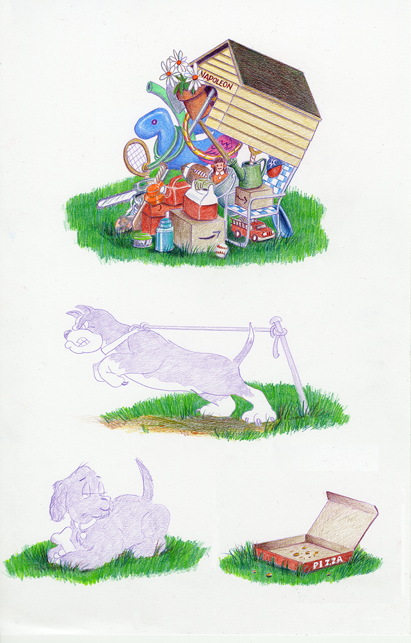
Transfer or trace the final line art onto a smooth sheet of bristol board. I generally use a violet pencil for this ... I have no idea why ... it's not exactly a neutral color. But it was a habit I got into when I used to draw portraits. The initial violet lines worked well and disappeared underneath warm skin tones of peach and sienna.
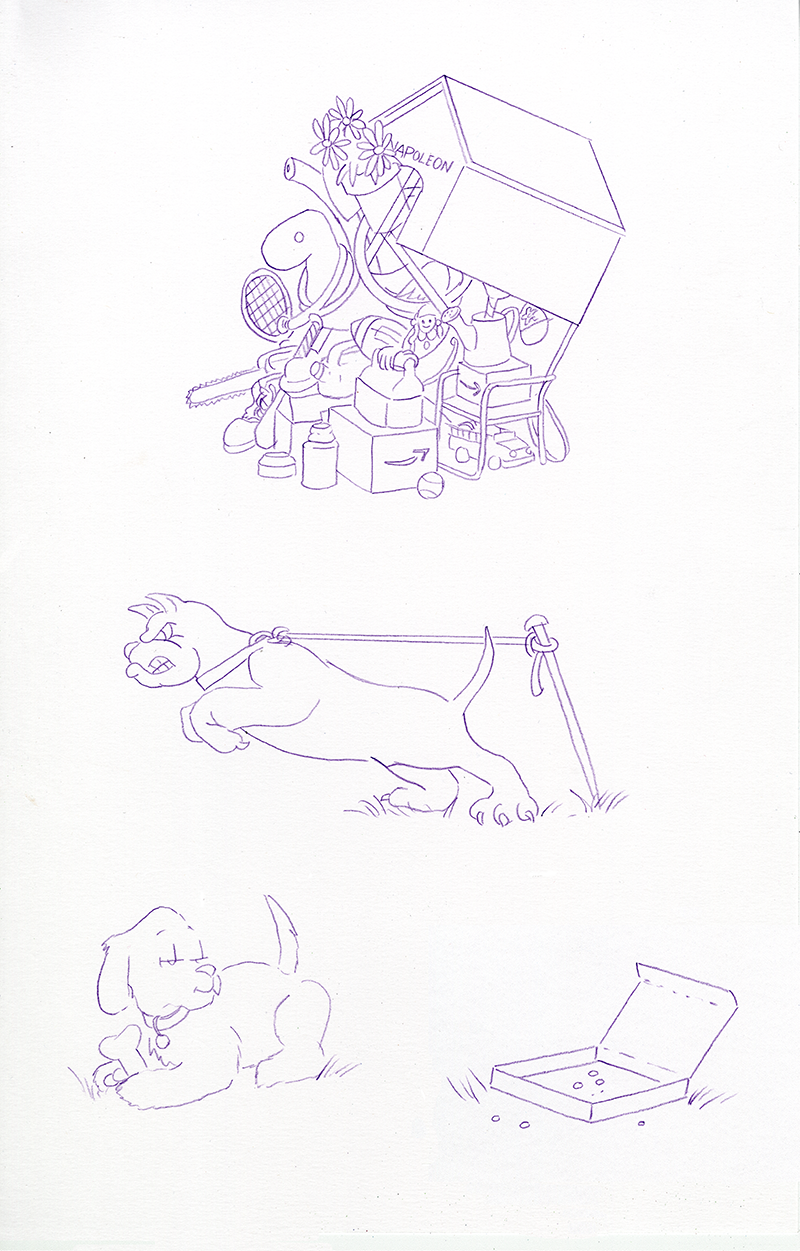
Whatever color you start with, make sure it's a colored pencil and not a standard graphite pencil. Graphite lines won't really hurt anything, but they won't blend into the waxy colored pencil lead. Very soft graphite will actually get into the wax of lighter colors like yellow and green and make them look dirty.
If you transfer or draw the initial outlines with a graphite pencil, go over them with a colored pencil, then erase the graphite lines with a kneaded erasrer. It won't disturb the colored pencil.
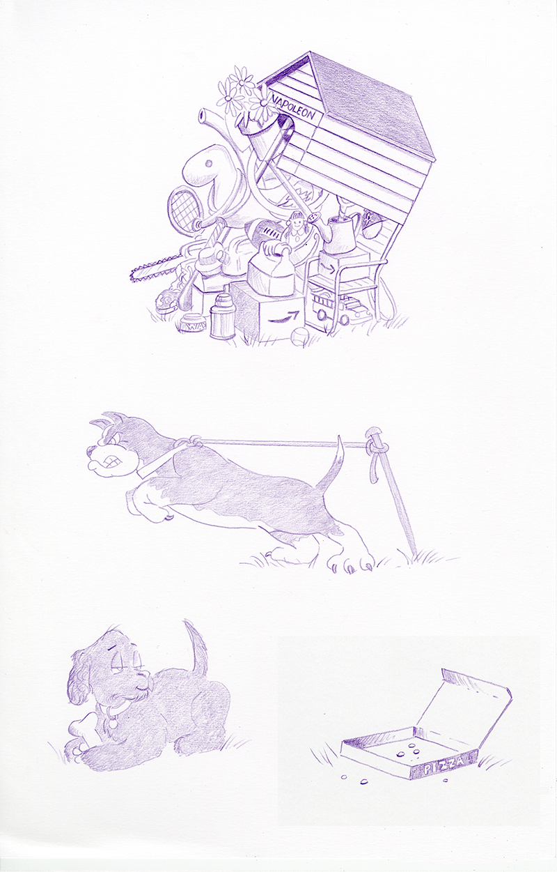
When it's all outlined on the board, I do a light value rendering using the same Violet. This gives me a kind of "road map" by establishing major shadow areas and important details like the "A" on the baseball cap, the lines of the siding on the dog house, etc.
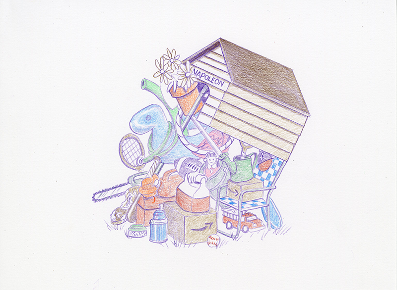
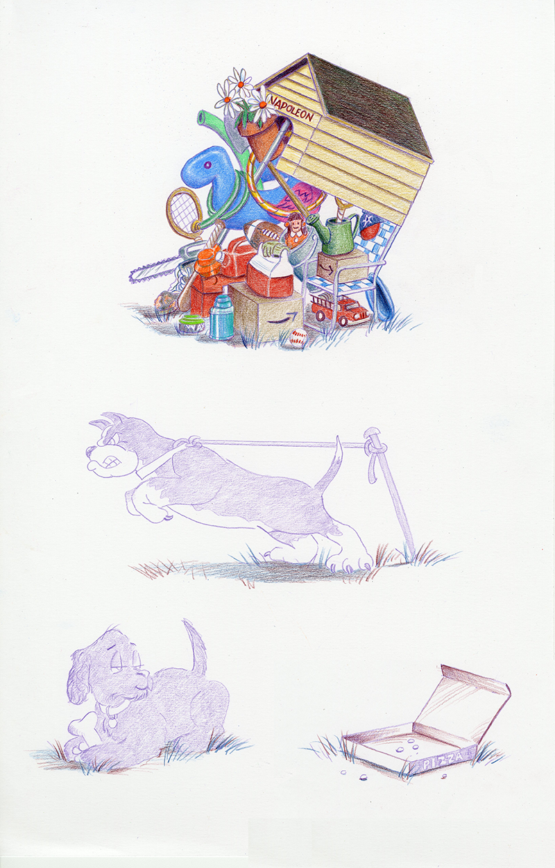
Let's focus on the dog house and all of Napoleon's stuff for a bit. The dog house roof and shadows get a Light Umber wash and the siding gets a light wash of Sand. The flower pot gets a light wash of Burnt Ochre and the flower petals get outlined in Light Umber.
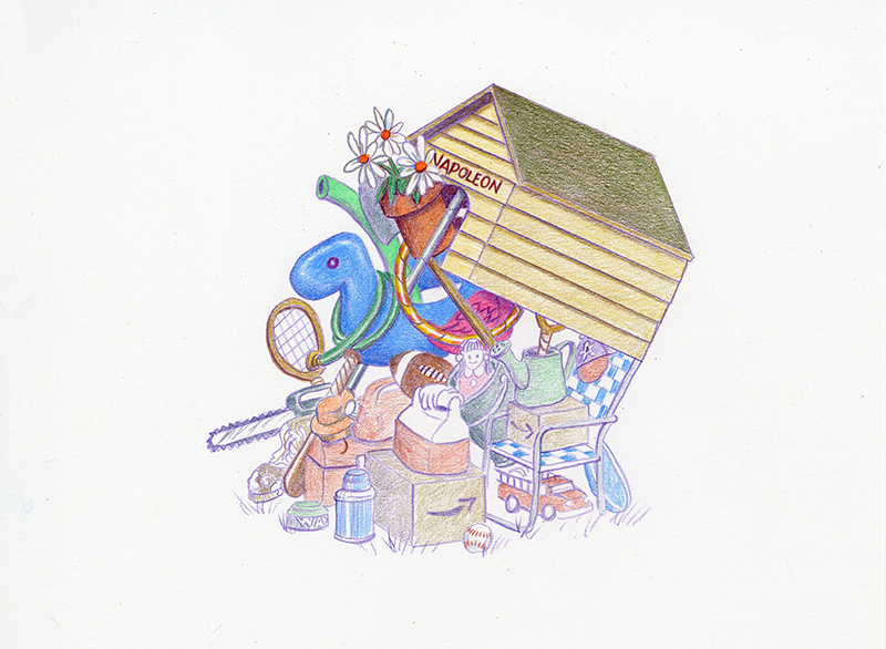
All the other items get an initial light wash of whatever their local color will be. Be sure to draw around highlighted areas like on the pool float. Colored pencil is like watercolor, no white! So you'll have to "draw around" white areas.
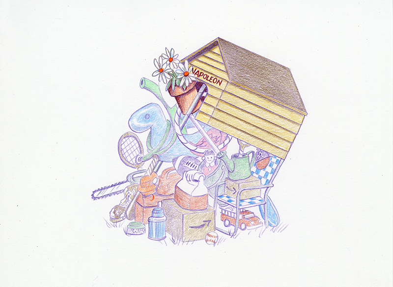
A second layer of Sand brightens up the siding on the dog house. Going over the name "NAPOLEON" with a nice red, Scarlet Lake, helps it to pop a bit.
On the flowers, nice bright Orange centers, a light wash of Grass Green on the leaves. The pot got more definition with some Tuscan Red deeping the shadows.
Tuscan Red also got added to the dark shadows inside the dog house. Deep dark areas like this help push the items in front forward, creating depth. I also added a very light wash of Light Cerulean Blue to the pole of the weed eater.

I outlined the flower petals again, this time in Light Cerulean Blue. This is a great recipe for shading and definition in and on white objects, like a white shirt, white trim on a house or building, or white flowers: Light Umber and Light Cerulean Blue. If you want to end up with cool shading, use the Umber first and top with the Blue. If you want warmer shading, use the Blue first and top with the Umber.
I wasn't so happy with that roof, so I added a layer of Olive Green. Much better!
The flower pot gets a final layer of Burnt Ochre. This final layer goes right over the top of the Tuscan Red shading, evening out the color and brightening it up. The same thing happens with a nice layer of Olive Green over the flower leaves.
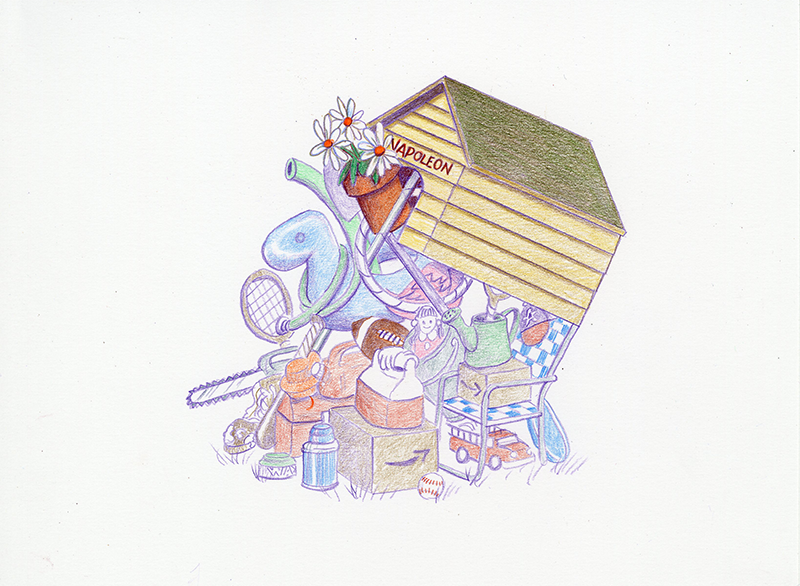
The Violet comes out again and I use it to define some shading on the pool float, the flamingo and the shovel. And some Burnt Ochre on the football ... again, coloring around the white areas on the stripe and the stitching.
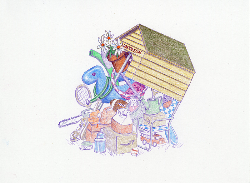
Here's the second layer of color on the float, the noodle, the garden hose and the flamingo, using respectively, True Blue, True Green, Grass Green, and Process Red. And a few beginning touches of Process Red on the Hula Hoop.
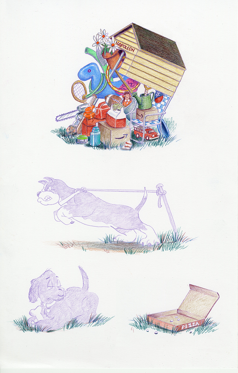
Burnishing is a wonderful colored pencil secret! After coloring an area, you go back over the same area with heavier pressure, generally using either a colorless blender, white, or a lighter or different color than the original. This makes the color really pop!
I burnished the pool float with Light Cerulean Blue, The flamingo with Pink, the noodle and the garden hose with True Green, and the hula hoop got a light layer of Spanish Orange, then another burnished layer of Spanish Orange. Notice the 2 different greens on the noodle and the garden hose ... I burnished them with the same color, True Green, but the garden hose started with a layer of Grass Green. This is how you build up the colors, because the colors are transparent!
Compare this picture with the last one ... what a difference! I love my pencils!
And the shovel got a wash of Slate Gray. And some Light Umber on the muddy boot and baseball bat.
Slate Gray on the bucket. And Yellow Ochre on the shovel handle and the tennis rackets.
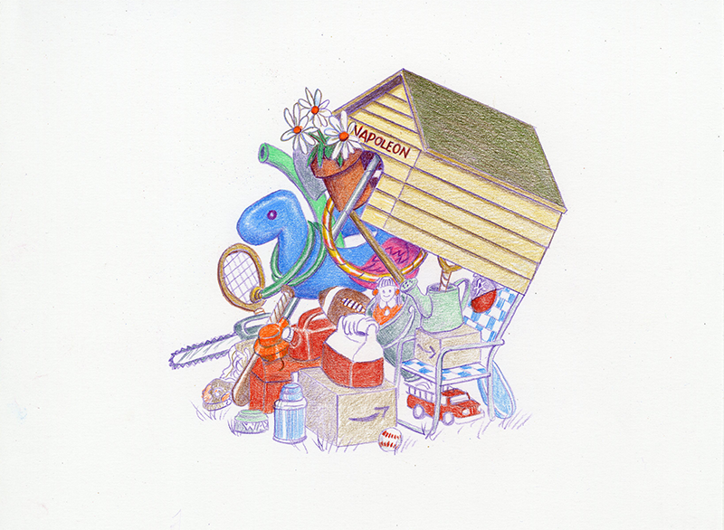
Second layers of color: Scarlet Lake on the ball cap, fire truck, baseball, cooler, tool box, and gas can. Orange on the weed eater and doll dress. And the slightest touch of Orange on that muddy work boot.
Here is Tuscan Red shading and details on the tool box, gas can, weed eater, fire truck and Amazon boxes. Some additional colors: Turquoise thermos, Olive Green watering can and garden gloves, Pink ribbons in doll's hair, and Light Umber on the Amazon boxes.
Shadows and shading give definition to objects and helps to make them look solid and distinct. But take care on pictures that are this busy, because if you don't it will all run together and just look like a mish-mash. Simple and clean is needed here ... less is more.
I noticed a boo-boo here, too ... a tiny speck of hula hoop was showing from inside the dog house door ... so I got that filled in.
The roof's still bugging me, so I toned it down a notch with a layer of Indigo Blue. I used Indigo for some shading and definition on the watering can, the bucket, the football, the tool box, gas can, Amazon logos, the chair webbing, the cap, and tried to help that poor frisbee look more like a frisbee! A touch of Spring Green on the Wax can lid.
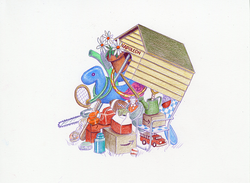
And Indigo Blue will begin our shading for the ground and grass, so we'll bring back Napoleon, Chloe and the pizza box and give them the same treatment.
This is a little trick I employ when illustrating books ... when anything or anyone appears on more than one page, I draw all the instances at the same time. Doesn't matter if it's a character, an object or a background. Because if you draw grass on a page today, then a week later you draw grass on another page, it's not going to look the same. So everything I do to the grass under the dog house, will be done to the grass under Napoleon, Chloe and the pizza box. Same colors, same steps, same order on all four.
A layer of Tuscan Red on that green roof will neutralize it and tone it down even more.
I also used it to darken and define shadows a bit more to crisp things up, color the doll's hair and to begin defining the pizza box.
And a layer for the grass and ground, too.
The pizza box was fun! I used Light Umber to get that "cardboard" look, and a first wash of Scarlet Lake for the printed outside.
There's a wash of Light Umber for the ground under Napoleon ... grass can't grow under this guy!
Some Peacock Green on everybody's grass.
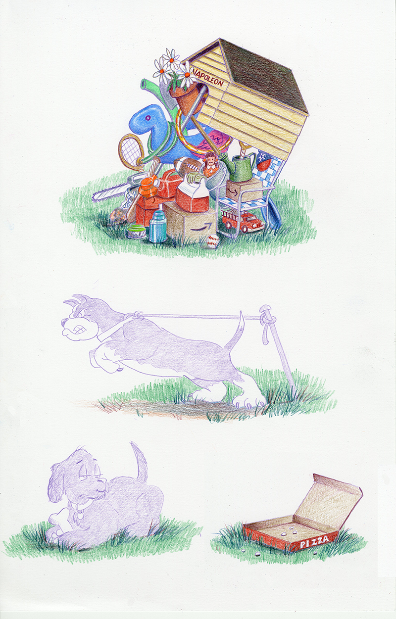
A second wash of Sacrlet Lake and Light Umber on the pizza box. Grass Green on everybody's grass.
A second wash of Grass Green on everybody's grass.
Yellow Ochre on the ground under Napoleon.
Burnt Ochre and Yellow Ochre on the leftover pizza crumbs.
BOOM! My favorite part of drawing grass ... a burnished layer of Spring Green over all! This is why I LOVE MY PENCILS!! Keeps me coming back for more!
Let's work on those pups ...
Here comes the Violet pencil out again! Like the initial step above, I use this to define the shapes and shadows and "map out" where I'm heading.
Chloe's bone was shaded with the Violet pencil, then colored with Sand, which is on the yellowish side. Yellow and violet are compliments on the color wheel, which means they will neutralize each other ... look closely and you will see the difference between the Violet on the bone's shading, and the pure Violet on her paws. Layering the colors makes all the difference!
And some Scarlet Lake and Light Cerulean Blue on her collar and tag.
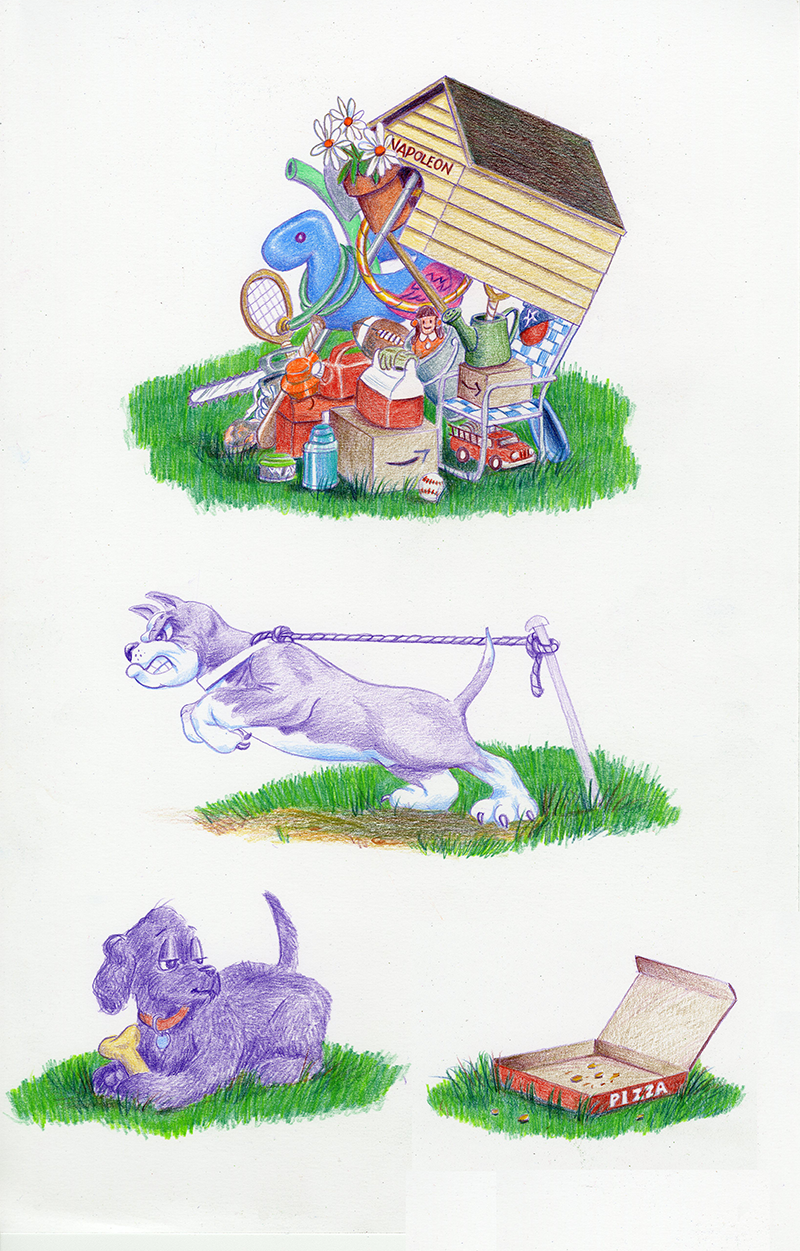
Remember earlier I gave you the tip of shadows and the outlines on the white flowers? Well here we are again! I wanted the flower shadows and outlines to be cooler, so I used the Light Umber first and the Light Cerulean Blue second. Here on Napoleon's white parts, I want warmer shading, so the Blue will come first ... and there it is!
Here's the wash of Light Umber on Napoleon and his rope. See how it tones down the blue shading on his white areas.
Chloe gets a wash of Violet Blue.
Napoleon gets a little more definition with Tuscan Red and Dark Umber in his shadow areas.
Chloe gets a wash of Dark Umber, then a second layer of Dark Umber to give her some definition. And a final layer of Scarlet Lake and Light Cerulean Blue on her collar and tag.

Napoleon gets touches of Pink and Orange around his mouth and his eye, and then an even wash of Burnt Ochre everywhere except his white areas. Here's a really good example of how the layering works ... his collar has the same Burnt Ochre wash as his body. It looks different because on his collar, it's just bare white bristol board underneath. But on his body, that layer of Burnt Ochre is covering 2 layers of Violet, Light Umber, and areas of Tuscan Red and Dark Umber. And they're all visible!
The stake got a wash of Slate Gray and then Dark Umber on top for the shading.
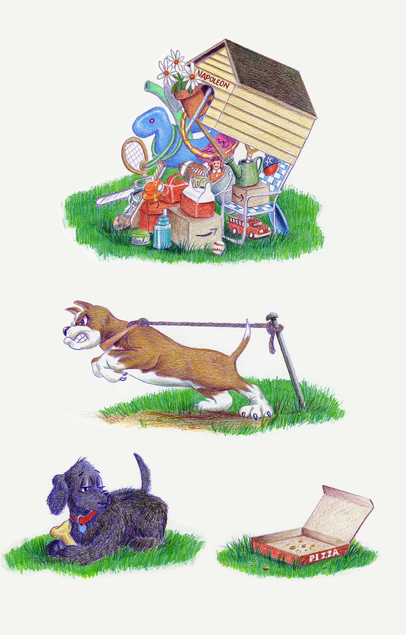
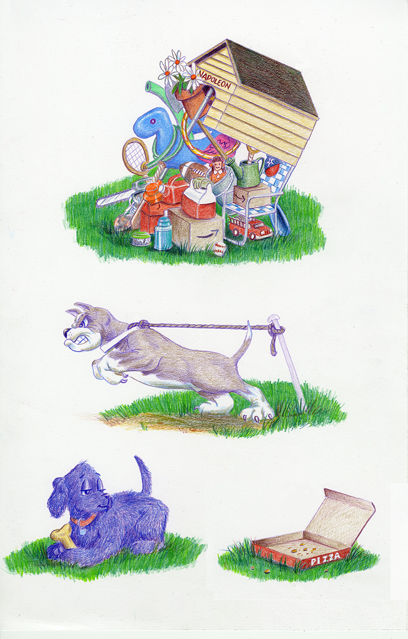
Now the final glorious touch ... a burnished layer of Yellow Ochre over all Napoleon's colored areas. It breathes life into him!
The rope and the stake barely have a layer or two of color, so their "flatness" contrasts with Napoleon's vibrancy and makes him look more alive! Even though it's a flat picture, nobody would be surprised if he popped off the page! Let's hope that rope holds!
A few touches of Tuscan Red on the ground and it's all done!
Now it's ready for scanning and turning into a Homepage for the website.
And if you ever needed to know ... this is how my days are spent!
Thanks for letting me draw for you!