
Remember these guys?
They were just some simple stick figures from The Meek and the Mighty article.
Meek, because there's really not much to them. Mighty, because these simple figures lay the foundation for some potentially energy-filled characters.

By making just a few adjustments to the lines – a curve here, an angle there – we instantly breathed a bit of energy and emotion into them. They're beginning to tell us a little something about themselves. These are the beginning steps ... this is how illustrators tell stories without words.
But we're just getting started! Let's get busy ...
Putting Bodies on Those Stick Figures
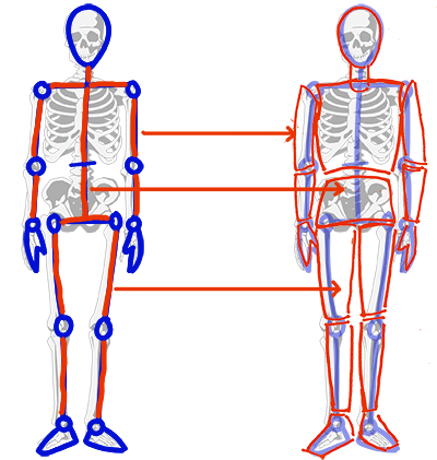
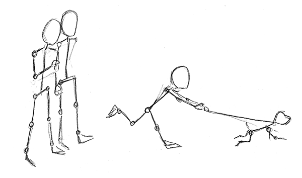
A stick figure is just an abbreviated skeleton. The circles, and the line at the waist indicates joints and the places where the body can move and bend. The sections of body between the joints don't bend, but the joints provide leverage for those sections to be moved and turned. The torso is divided into an upper and lower section above and below the waist. Both need to accommodate the width of the structure inside: the ribcage for the upper and the width of the pelvis.
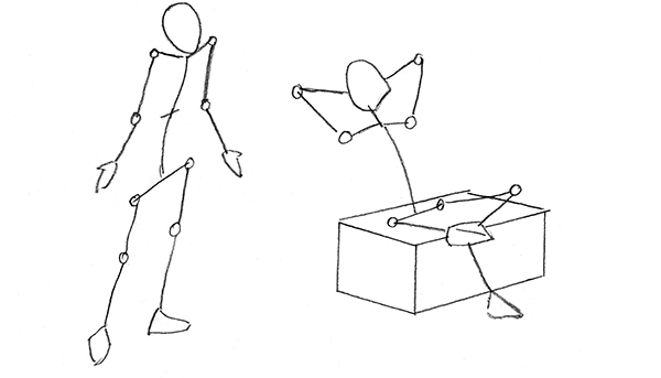
Following the direction of the lines in our stick figure, let's give these guys some form and dimension.
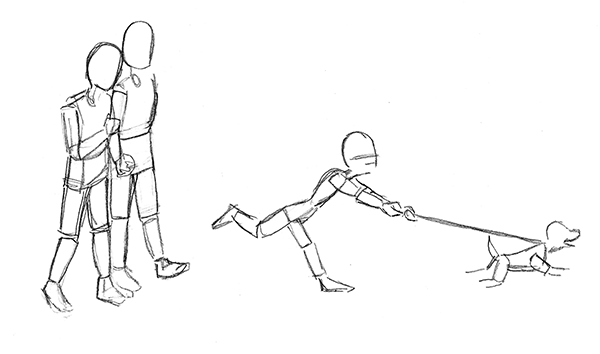
Now, using those blocked in shapes as a guide, we can draw their bodies.
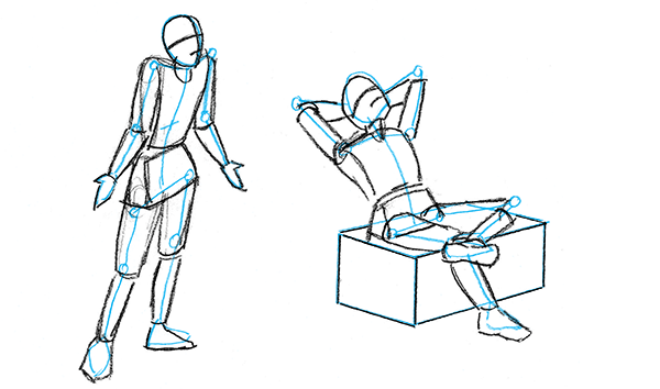
One of the hazards of my job ... I always end up with pages of naked people! But that's exactly what you want ...
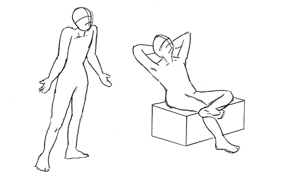
Just like you can draw the outside of a body better when you know what's going on inside, you can clothe your figures better when you know what's underneath.
Despite my style being very cartoony, this works great. The more you learn and study anatomy and observe how bodies move, the more believable your figures will be, whether they are realistic or cartoony. Even if you're drawing animals or mythical creatures ... there is a logic to how any body moves, and no matter how fantastic a made-up character or creature is, you will breathe life and believability into it if you capture that logic of movement.
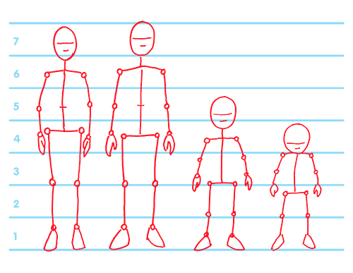
Young, Old, Boys and Girls!
Let's get some variety. There are just a few simple tricks to making these figures look male, female, younger, grown up ...
• Adults average 6 1/2 to 7 heads high. A school-age child should be 4 1/2 to 5 heads high.
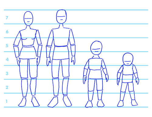
• For Men:
- Their heads can be more squared off with sharper angles on the jaw line.
- Their shoulders should be more square and wider than their hips.• For Women:
- Their heads are rounder, oval or heart shaped.
- Their shoulders should be softer, rounder and more narrow than their hips.• For Children:
- Their heads are rounder. The younger they are, the rounder that noggin!
- Their eyes and mouth are lower on their heads the younger they are.
- Very young children and babies have practically no neck! It will grow as they age.
- Before the teen years, there's not much difference between school age and younger boys and girls. Distinquish between them with hair and clothing styles.
The better we understand these very basic concepts, the better we can capture all that energy and emotion. That's what makes an illustration jump off the page and communicate with the reader.
So keep practicing with these ... it's not easy at first, but the more you practice, the more second nature it will become. And these early planning steps, though a bit tedious, will make the final outcome much better.
The stick figures will layout the basic plan, helping you figure out angles, proportions, perspective. Even at this initial stage, you can already get a sense of the characters, who they are, what's happening.
In the blocking in stage, your characters start to come to life as real solid people. In this stage you can solve problems like what elements should go behind or in front, if characters are too close or too far apart. This is the benefit of good planning, potential problem areas will pop up and get resolved more easliy.
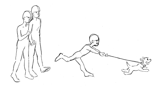
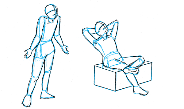
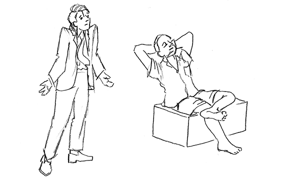
Now we can outline their shapes and when we remove all the sketchy lines, we can see how we did ... do their bodies look solid and natural? Balanced? In proportion? Get the bodies right, then add clothing. Beautiful clothes won't disguise poorly drawn bodies underneath.
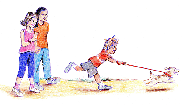
But people in real life aren't so uniform ... there's short ones, fat and skinny ones tall and gangly ones. They express themselves wordlessly through facial expressions, mannerisms. posturing their body. And characters in children's book sometimes need to be distorted or exaggerated in some special way ...
We've got a good foundation here, so now it's time to see how we might push the limits a bit ... check out Part 3 ... let's experiment!