Putting together a picture book is not rocket science. It's also not a walk in the park. It's going to require ALL of your brain and ALL of your heart.
If you operate soley from your brain and don't allow influence from your heart ... or if you're just all heart and soul with wild, free creativity with no practical influence from your brain ... you're going to end up with an ugly baby. Count on it.
But I'm going to show you how to balance it all out and end up with a beautiful baby!
I just wanted to give you a heads-up in advance, because the beginning steps of laying out a book will require more brain and less heart. But the heart and real fun will follow later, and these initial steps – while tedious – are very, very important ... so hang with me ...
In Part 1 we wrote a story based on a tale that gets told in the Okefenokee Swamp about Gator Joe. We're going to turn that into a 12-page book ... or more correctly, a book with 8 inside pages and an outside cover. After allowing for the outside and inside covers, title, dedication and publisher's info pages, we're left with 6 pages in which to tell our story. We made a storyboard with the pages numbered, and roughly planned what part of the story will go on each page.
Unless there's a good reason for it, picture books don't normally have page numbers. I've included them for clarity in these demos. A spread is 2 facing pages and what a reader literally sees when looking at an open book, so that is how we will work to design and layout what the reader will see and experience.
And how can you tell what/how much text goes on each page/spread? Read it out loud ... and listen ... your ear will pick up on natural "breaks" in the story.
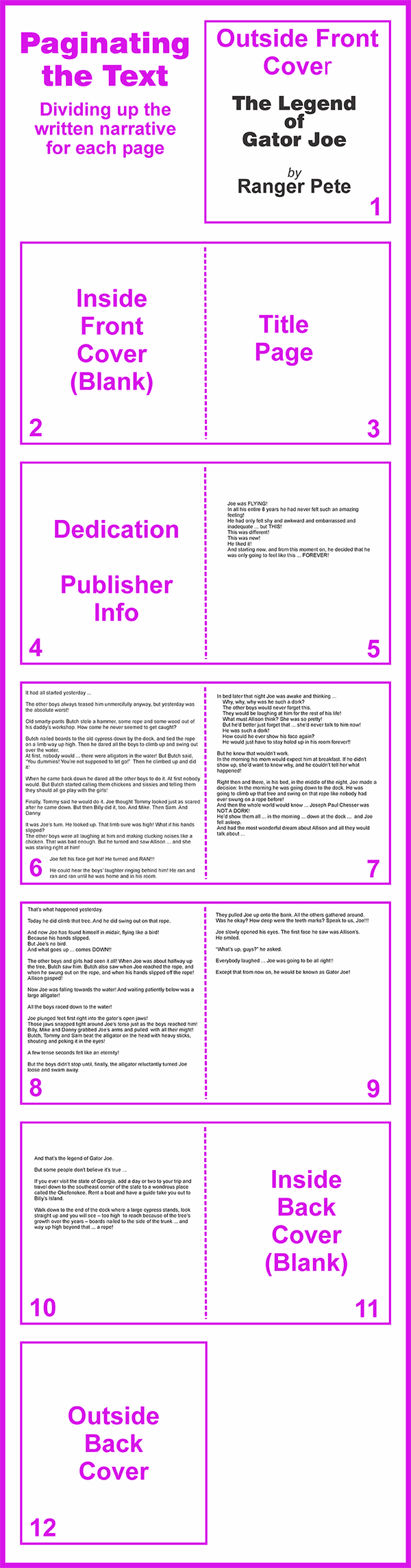
We've got a lot of text for only 6 pages! We may need to adjust ... but the only way to figure it out is to layout some actual-size pages to see how much space we really have.
Sizing and Measurements
Never, NEVER, NEVER begin layout and design work without knowing the page size! This is so important!
There are books where the copy just sits in a box below or beside the picture. Or perhaps the copy is on one page and the illustration is on the opposite page. Sometimes you'll want to create a bit more energy than that and wrap the text around the illustration. Let the style and tone of the story tell you what it needs.
Type and pictures must work together. 10-20 lines of 12-16 point type can flow very differently on a tall page or a square page. And how that type flows will have a tremendous influence on how creative you can get with illustrations.
You also need to factor in margins and bleeds for the printer. Once you and/or your publisher have determined the dimensions of your book, the publisher/printer can tell you what they need for margins, bleeds, etc. I can't stress how important this is. Don't spend weeks designing and drawing for 8.5"x8.5" book, then find out that what was needed was 8.5"x11". Don't think you'll just enlarge or reduce to a new size and make it work easily! It WON'T!! Sometimes you'll get lucky, but don't count on it! For a good discussion on proportions, check out The Caribbean Man in Freebies.
For this demo, I really like the square pages, but there's lots of text on these pages, so let's do a verticle layout with an 8"x10". A few extra inches might help a bit with all that copy.
We will be designing and working in Spreads – which is simply 2 facing pages – right and left pages – as the reader will see them:
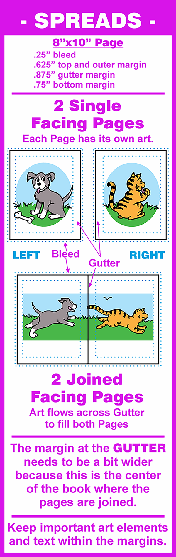
For these initial planning stages, we'll be working with spreads as 2 joined pages. When we begin the final art we may need a spread with 2 single pages. We'll cover that and why it's needed when we get to that point.
Planning The Layout
So now that we know the sizes and parameters we need to work with, let's begin thinking about what we want to depict in the illustrations on each page ...
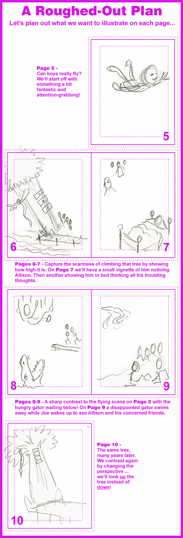
Looks like a good plan, but there is so much written copy, especially on Pages 6 and 7 ... let's see if we can get the text sized correctly and still have room for pictures ...
Adding and Flowing the Text
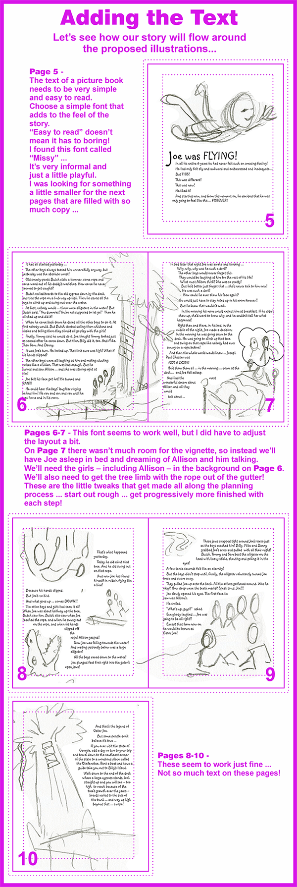
In a picture book, text and pictures need to work together. They need to compliment and enhance each other.
You can get a little creative with font selection as long as the font you select is clear and easy to read. And it needs to fit well with the tone and style of the story.
Then flow the text around the pictures. Illustrations need to be placed in a sequence and in locations that follow the sequence of the narrative.
And just like that, we've got a great plan for our book! Now we know exactly what will happen on each page and exactly how much physical space we have available for art.
Time for some fun ... let the drawing begin!
Join me for Planning Your Book-3!