- [email protected]
- Fayetteville, Georgia
A Wink and A Nod to
- GRAYSCALE -
When the world was black and white, we really didn’t have a choice.
Then the 1960’s came. And there was color! Then we didn’t want to.
But occassionally it gets thrust upon you and you’re back to not having a choice . . .
So if we’ve gotta’ do it, let’s learn how to do it better than we’ve been doing it!
Consider graphic guy.
He is a member of a really cool club.
They are planning a fun event and they want everyone to come.
They need to get the word out. They need flyers.
Hey! We have a graphic guy in our club. He can lay them out for us!
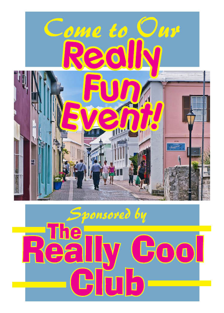
But graphic guy doesn’t mind at all. These are his fun friends in his really cool club, and he is glad to help. So he gets all the specifics.
In a few days he brings them a layout.
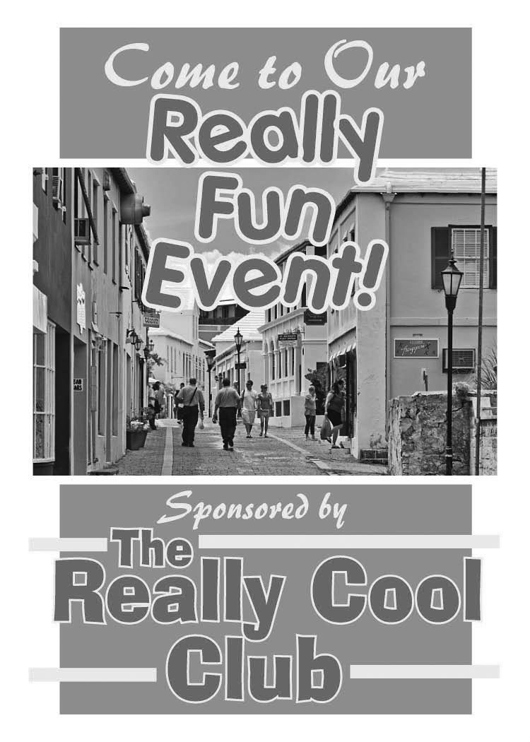
Graphic guy thinks, No problem! I’ll just convert the whole thing to grayscale! A couple of clicks and I’m all done!
This is what he gets. And he will get about the same thing if he gives the color file to the printer, and just lets him print it on his black and white digital press.
It’s not terrible, but it’s not great!
If you want great in grayscale, you need more contrast to make it pop. Let’s help graphic guy make his black and white flyer pop!
Very, very simple and uncomplicated. And only a couple of steps.
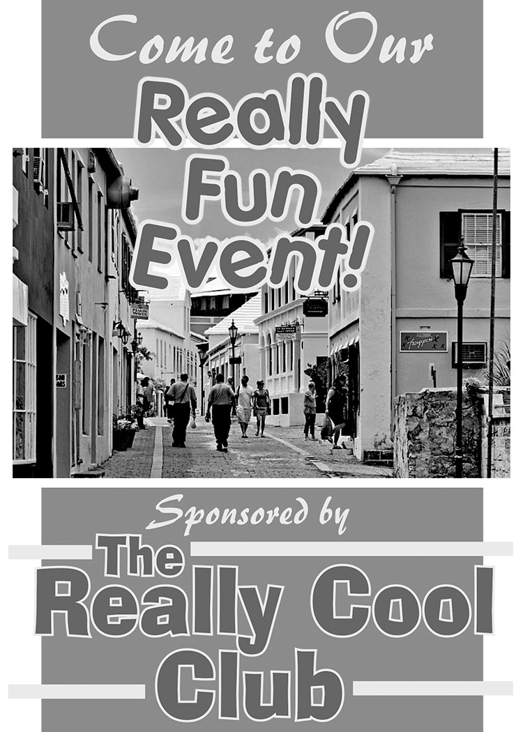
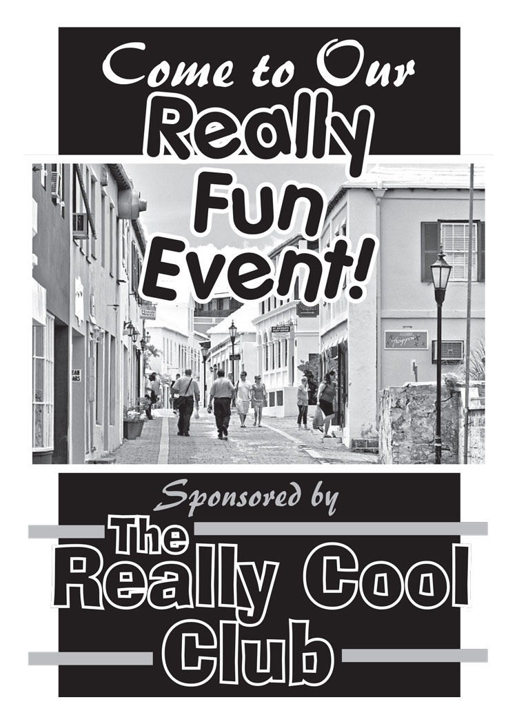
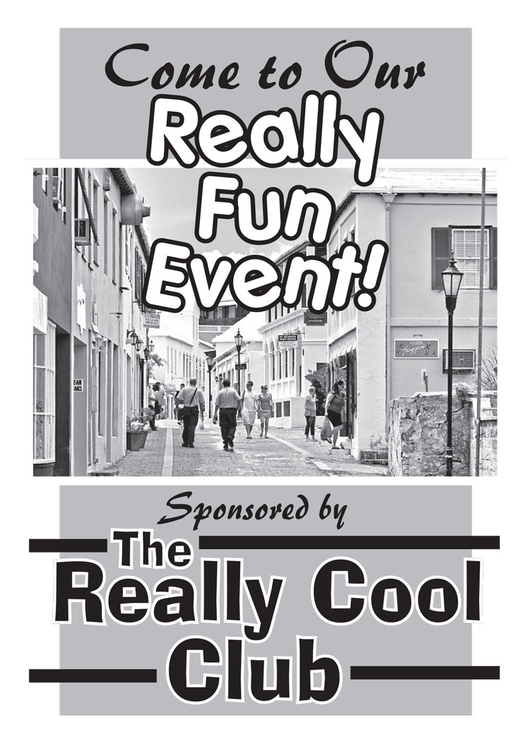
Now I realize this isn’t ground-breaking stuff. No one’s going to be in awe of my fabulous flyer skills. Or be beating a path to my door to see genius at work.
But if you’re here visiting my site, and you work or volunteer at a school, church, community organization or club, and maybe you are in charge of little things like this to promote the activities, just know that there are very simple things that you can do to your promotional materials to keep costs down and still keep a professional image. Even if you don’t have access to professional graphics programs, or can’t afford expensive graphic services, you can still make your printed materials look terrific! If all anyone knows about your organization is that flyer or brochure, let’s give them a great impression!
Remember, for black and white printed materials:
- Print from grayscale or black & white files, not full-color files.
If photos, clipart or other graphics are color, convert them to grayscale. - Get lots of contrast to draw the viewer’s eye to the important elements on the page.
And when you do print in full color, make certain your file is cmyk and not rgb! Please see my article “CMYK-RGB Side by Side” in the menu at left for more info.