So all we have left now is a cover and the copyright and title pages. Let's begin with that all-important cover ...
Before a reader ever opens it up to see the inside pages, a book is already communicating to them. Because the cover has an important job to do ... and that's to give potential readers a taste of what they might find on the inside pages and communicate that they will really enjoy reading this book. It entices them in for a closer look. At least, that's what a well-designed cover does.
Lousy covers communicate to potential readers, too. But their message is more like: I am the product of an amateur. My story is as poorly written as I am poorly designed. We are both dull and uninteresting and unworthy of a closer look. So don't bother checking me out, much less reading me!
Lousy covers are the first, sad sign of an ugly baby. Let's make a great cover for our Gator Joe book ...
Preparing to Design
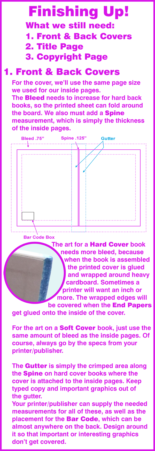
For a clearer diagram of the parts of a book cover, check out Producing Your Book - Part 3. Just like the inside pages, before we begin laying out, designing and drawing our cover, we need to know the printing parameters we must consider:
Cover Elements
Every cover has the basic elements that lets the potential reader know the pertinent information:
Front Cover Must-Haves:
• Title
• Author Name
• Illustrator Name
• Story-related Graphics/Illustration
Front Cover Optionals:
• Tag lines or brief descriptive copy
Back Cover Must-Haves:
• Barcode
• Publisher Name/Logo
Back Cover Optionals:
• Descriptive copy of story
• Author and/or Illustrator bios
• Story-related Graphics/Illustration
Spines Over .25" thick
• Author
• Title
• Publisher Name/Logo
Photos/Graphics/Art for Front and/or Back Cover
• Can either be 2 separate images
• Can be 1 image that wraps from front to back
Cover illustrations need to reflect the book subject. You will most likely be featuring your main character there, but you don't want to give away too much information. For instance, if your story has a surprise ending and something happens to your hero that changes his appearance, you may or may not want that shown on the front cover.
For Gator Joe, I'll definitely show him with his alligator bite scars. But if he had been a knight who slays a dragon at the end of the story, I might illustrate him in armor to show that he's a brave knight, and I might possibly show a dragon. But the dragon would be smaller and in the background, maybe even just a silhouette to let the reader know it's a story about knights and dragons. But I would not show the slain dragon on the cover. That would kill the suspense inside the book when I want my reader on the edge of his seat ... will the knight win? Or will the dragon win? They have to read the story to find out.
Designing a book cover is a lot like learning to be a Jedi knight ... you have to feel your way through it. You can't force it. Relax and let the story and the title tell you what's needed. If you get stuck, take a break, go for a walk in the sunshine. Then come back fresh and relaxed and get it done ...
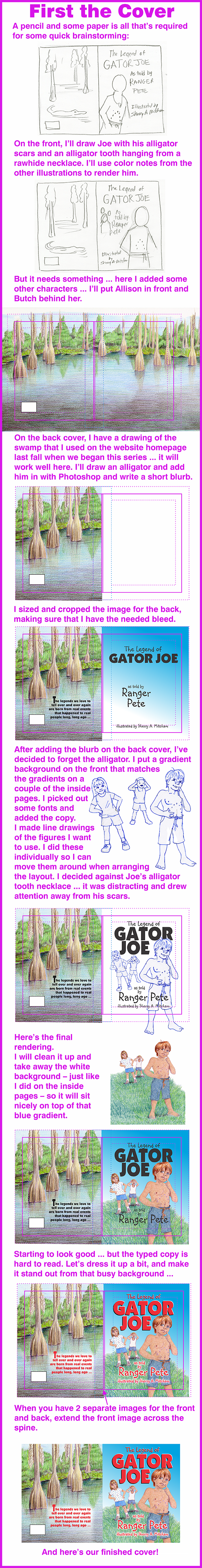
The cover is supposed to grab your attention and make a reader curious enough to open the book. Do it by making the title bright and bold so it's the first element that draws their eye. Then their eye travels around the page, first to Allison and Butch and then finally to Joe and hopefully to open that book and begin reading!
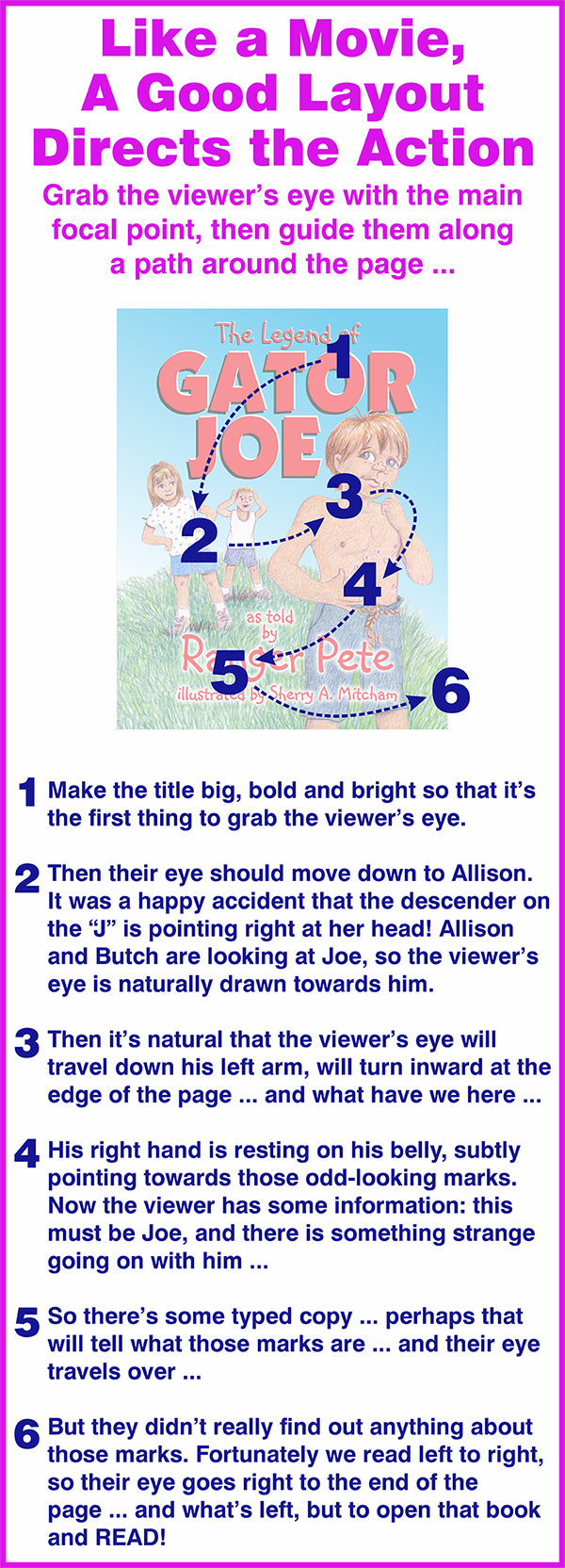
Covers are really important, but every page in a picture book needs to flow like this. Even in books where the type and pictures are on opposite pages, the pictures themselves need to guide the reader's eye and attention.
Having a good eye for layout is akin to playing a musical instrument by ear. Just like a musician's ear can hear when a note is off or is just right, a good layout artist will know instinctively when something is blocking the "flow". It's a skill that can be learned by practice and observation.
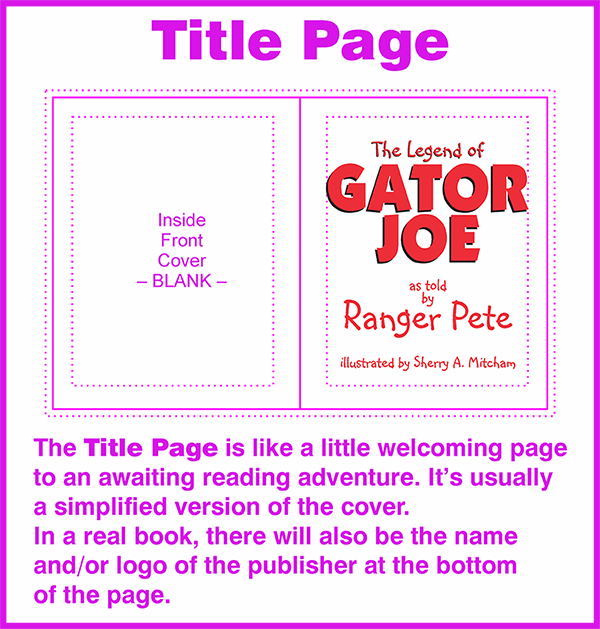
Meanwhile, we've got a little left to do ... a title page and a copyright page.
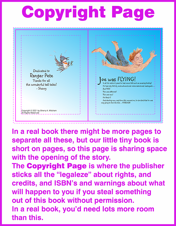
I added a dedication on the Copyright Page. I doubt that the real Ranger Pete – Pete Griffin – will ever see this, but if he does, I'd like for him to know how much we enjoyed his stories during those wonderful trips to the Okefenokee.
Whew! Are you worn out yet?
Putting together a book is a big project!
Just one thing left to do ...
Preparing the Print Files
Anything your printer will need is common to all printers. Files for offset printers will be a little different than files for digital printers. You will always be running into special circumstances with individual printers. And the information that follows is generalized, so always check with your specific printer before setting up files for them to use.
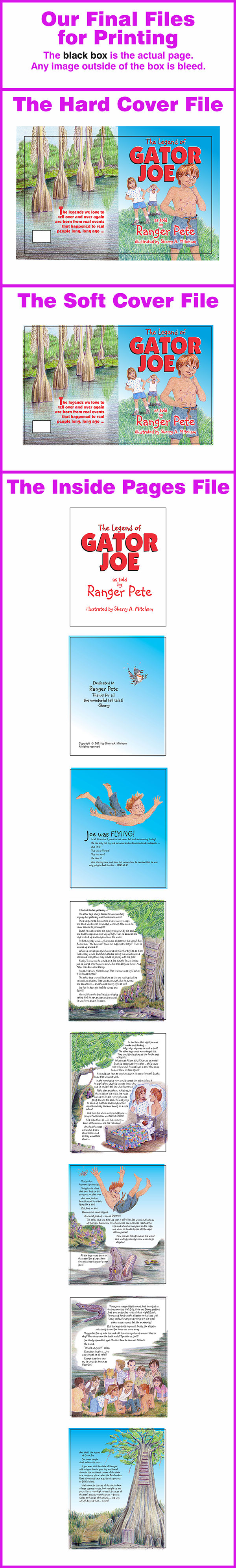
For most books, you will need three files:
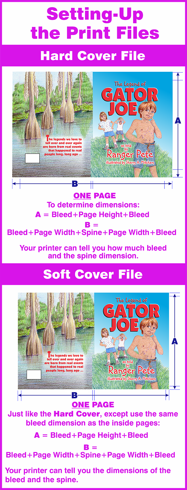
• A Hard Cover File – a 1-page file with appropriate bleed and spine measurements included.
• A Soft Cover File – a 1-page file with appropriate bleed and spine measurements included. Soft Covers need less bleed than Hard Covers, usually the same amount as the Inside Pages.
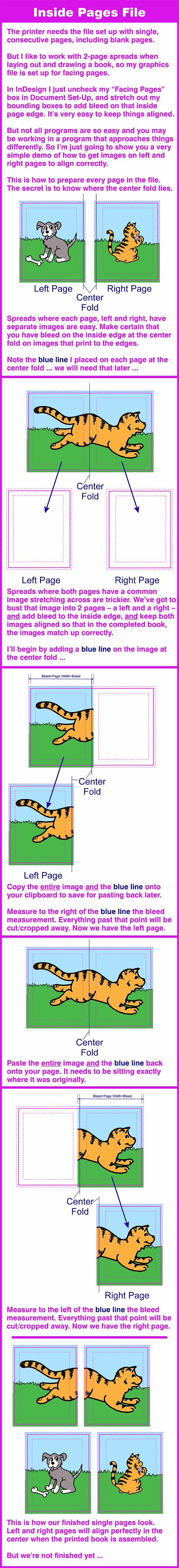
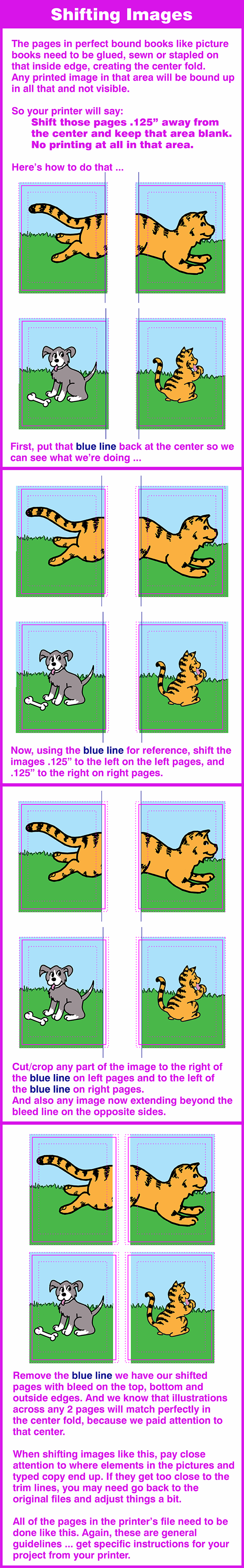
• An Inside Pages File – if you work like I do, you've been working with 2-page spreads. For the printer's files, these need to be changed to consecutive single pages, including blank pages where they appear. All pages need to have appropriate bleed. Each page needs to shift away from the gutter a small amount – usually .125” – to allow room for the book to be bound. Left pages will shift left; right pages will shift right.
Here’s the quick and dirty list of must-do’s to get files ready for the printer:
• Get specs from the printer regarding requirements for bleed, margins, etc.
This should be done right from the start before you even begin drawing. It’s so helpful to know, for instance, that on a Hard Cover book the printer requires an inch or more of bleed, so you’ll be certain to make art and images extend out. Throughout the whole process of drawing, typesetting and layout, keep in mind what the printer needs.
• Proofread everything carefully
After you’ve looked at and read the same pages and copy over and over for weeks and weeks, it is so easy to miss something. Always proofread when very fresh. Lay it all aside for a few days, the come back to see it all anew. Hire some fresh eyes from someone who hasn’t seen or read it at all. I print out the pages and make dummy books throughout the process to get an idea of how the pages look when put together. And a color dummy at the very end. It’s easier to proof a paper-printed copy rather than proofing on a computer monitor.
• Make all graphics 300 dpi
Art that is printed needs to be sharp and clean. When scanning art, scan it at 300 dpi and adjust the settings so that the dimensions are as close to or slightly larger than what you’ll be needing. Don’t pull art off the internet to use in print files. It will need to be re-created. For instance, you might need a logo from your publisher. Web graphics are low resolution and look great on monitors, but they’ll be fuzzy when printed on paper. And they’ll be RGB. If you need sharp art, contact the company or website and request hi-resolution or vector art.
• Make all graphics CMYK
NO spot colors. NO rgb colors. Image setters and digital presses cannot tell how much cyan, magenta, yellow and black to use if they are reading the files and only see red, blue, green or PMS 185. Scanned art or art from cameras is RGB, and in programs like Photoshop you’ll need to work in RGB mode to apply some effects. Be sure to convert to CMYK mode when the art is ready to insert into your design.
• Make all blacks Process Black
That’s the K in CMYK. Don’t use that beautiful, dark RGB black sitting in the palette over on the side in your graphics program. I know it’s gorgeous, but it won’t work. If you want a rich black in CMYK, use this: 60c40m40y100k. This looks great on typed copy printed with digital presses. But check with your printer, because some may not want you to use that, especially offset printers.
• Make a duplicate of your working file
Always keep a copy of your original working files AFTER making the changes above, and BEFORE making the following changes to a duplicate file. You might need it for making corrections and modifications later.
• Convert all typed copy to art in the DUPLICATE FILE
Never send a file full of fonts. If they don’t have those fonts on their systems, their computer will happily substitute something else that will be really crappy, and all your layouts will shift and look wack-o. And if it’s not glaringly noticeable (and even if it is) the files will get printed anyway and you’ll say, That’s NOT WHAT I SENT! and the printer will say, Yeah, it IS WHAT YOU SENT! and it will turn into a big, hairy mess and there will be weeping and gnashing of teeth. NEVER SEND FONTS!! And don’t get the bright idea to send the actual fonts for them to install on their system, because (A) That’s kinda’ tacky, and (B) They’re not going to do it anyhow. Make a duplicate file (so you’ll have one with the fonts intact for changes or corrections) and in the printer’s file, convert the type to curves or art or whatever your program calls it.
• Save each file as a PDF to send to the printer as per his specs.