We've got illustrations ... we've got type ... time to put it all together!
You will need 2 types of computer programs for this ... a good raster-based, photo-editing program that will allow you to work in layers, and a good vector-based, graphics/layout program. I use Photoshop and InDesign, but whatever programs you've got that can do those things will work.
First, let's get our illustrations ready ...
Preparing the Art - 3 Steps
1. Scanning
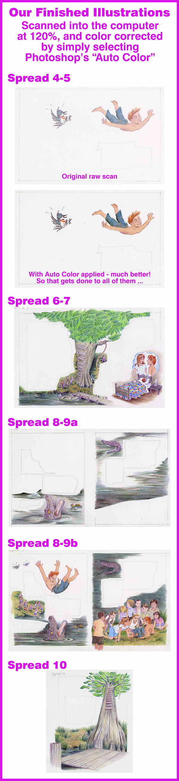
For art that will be printed, always scan at a high resolution, 300 pixels/inch at minimum. And it's best for the scanned image to be 100% the final size or a little larger. When we were ready to draw the illustrations in Part 3 I printed out the pages at 80% so they would fit onto an 11"x17" paper, giving me plenty of room to draw extra for bleed and to put space between single pages. So now, when I scan the final art into the computer, I will scan the art at 120% to get everything back to the correct size.
It's rare that the sizes won't need tweaking a tiny bit when fitting images to the type, but always try to keep tweaks to reducing and not enlarging. You can get away with it a tiny bit, but too much enlarging of a scanned image can result in fuzzy, pixelated images. You can fudge a bit for web images to be viewed on a screen, but the printing process is not so forgiving. Keep those images SHARP!!
Scan color images at 24-bit color. Color images will be RGB when scanned, and they need to stay that way when working with them. Some effects/features of Photoshop can't be applied unless you are in RGB mode. When the images are cleaned up and ready to use, convert them to CMYK mode before importing them into your graphics program.
2. Color Correction
The scanned images always look a little dull on my monitor, so in Photoshop there's a selection in the Image menu called Auto Color that I always apply. Other than that, I never do any color-correcting on the overall image for two reasons:
1. I'm not very good at it, frankly, because what you see on the monitor probably isn't exactly what you will see printed on paper.
2. On books I send off to people and places unknown, I never know or have any control over what the printed image will look like. So I just don't take any chances.
3. Backgrounds and Clean-Up
I've always heard that no matter what else, there are two absolutes in life: death and taxes. Well, I'd like to add a third absolute to that list: dust and specks on my scanner! Grrr!! It seems that no matter how much I wipe and clean the glass, there are always spots and specks on the image in the computer. If you want to see some good examples, just check out all those scanned images in Part 4 that I was too lazy to clean up ... specks and flecks galore!!
Most of it can be taken care of in this first step when I lighten-up the background ... I don't like that light, faint tint of color over all the white background. It's just how the bare bristol board comes through the scanning process. And it WILL print, especially on digital presses. These are areas where type will be sitting and open blank areas, and I just want the white paper showing and no image.
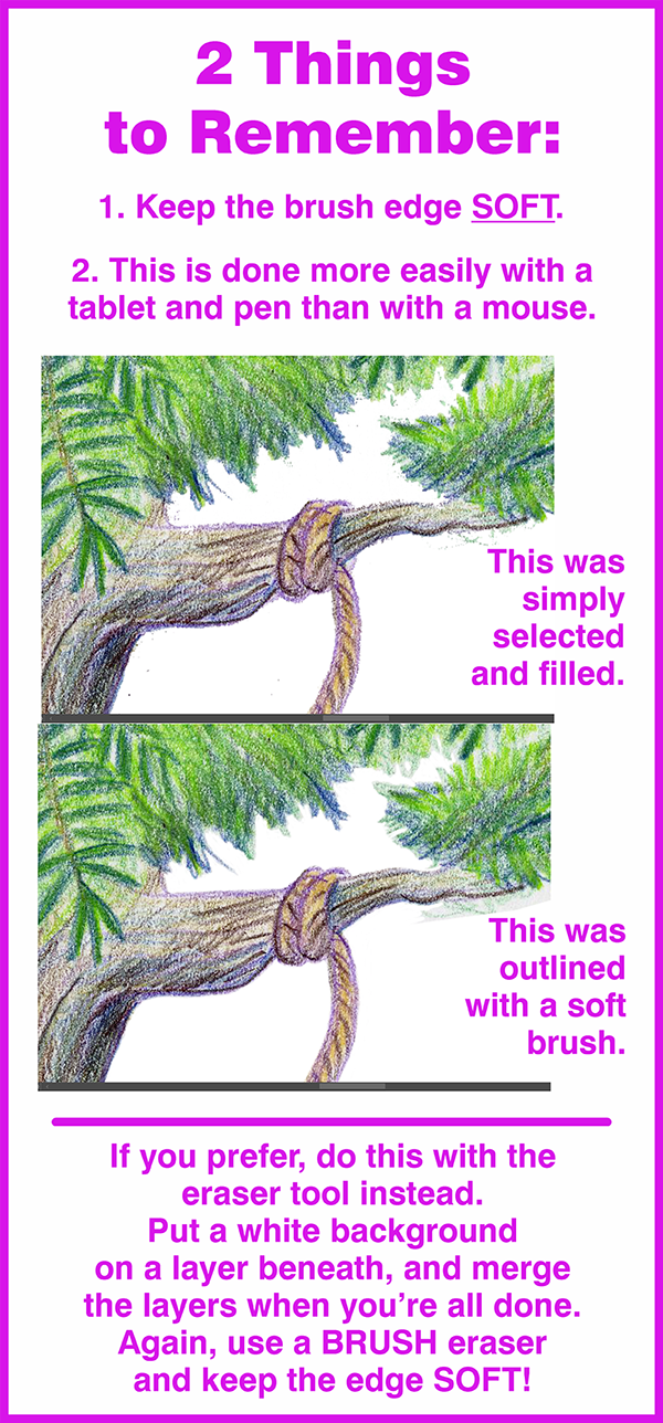
So I select the entire background, being very careful to eliminate any areas of actual colored art, and give it a white fill. Then I go around the edges of the colored art with the Paint Brush tool, a soft-edged brush, white fill, to eliminate any "halo" effect of left-over background. Hard edges are no problem, because I can isolate edges with the Lasso, but soft edges need to be feathered softly to blend in with the white background.
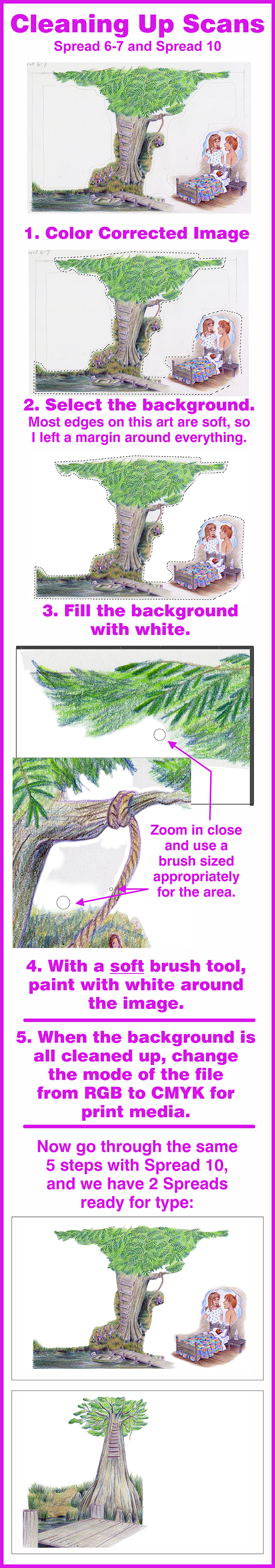
Yeah, it’s tedious! As I learn more about how to use Photoshop, I’m sure to find a better, faster way. But for now, I’m really satisfied with the results I’m getting, so I don't mind the extra work. But there's always a silver lining ... this is a great time to also clean up and fix little mistakes and stray lines in the art. I confess to getting a little lazy in my drawing sometimes ... I can get sloppy, but my brain says, That's okay! We'll fix it in the computer!
For any lingering specks and flecks in the colored areas of the image, get out the Clone Tool and get to cleaning!
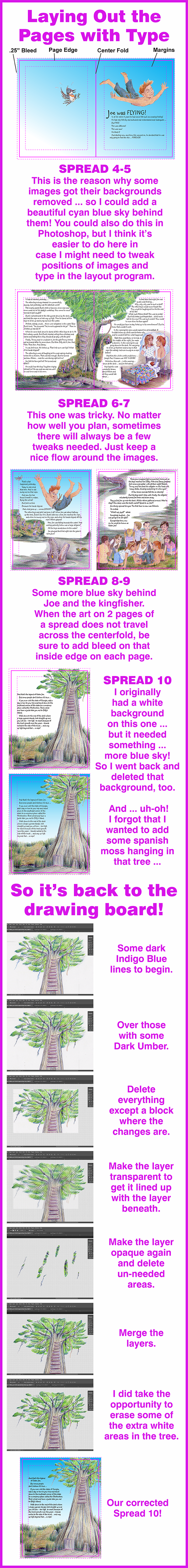
Instead of white backgrounds, Spread 4-5 and Spread 8-9 will get their backgrounds deleted, because I want to add a pretty cyan blue sky behind the figures of Joe and the kingfisher.
Time To Lay It All Out
So we've got nice colorful and bright images with clean white backgrounds all ready for some typed copy. And images with no background so that we can add blue sky behind them.
I know of graphic artists who will use raster programs like Photoshop for typesetting, and I do, too, for web graphics, but it's a bad idea for print media ... best to use sharp, crisp vectors for typed copy. So any good vector-based graphics program will work ... like Illustrator or CorelDraw, or layout programs like InDesign or QuarkXPress. You need to be able to layout both individual pages and spreads with images and typed copy, keeping everything within margins and adding correct bleed amounts. And after it's all done, to be able to export everything later as single pages in a PDF file set up correctly for the printer.
All of the scanned art you've imported should already be saved in CMYK mode. If not, DO IT NOW!
For black type and graphics use Process Black (the K in CMYK).
There is a mix you can use in print media to get a very dark, rich black – 60c40m40y100k – but check with the printer. Most printers are fine with it, but some aren't, so always get and follow specs from your printer/publisher.
In the rare instance you might be using clip art or images from other services or artists, always, always convert to CMYK before using in your layout. It's guaranteed they will be RGB.
Keep all fills and outlines in CMYK colors. Never, NEVER use SPOT or RGB colors ... NEVER USE ANY COLOR MODELS EXCEPT CMYK!!
A digital press or an image setter that makes the film separations for offset printing cannot determine how much cyan, magenta, yellow and black to use if you send them files with other color models, because that information will NOT be there!
I cannot stress enough how important this is. It's not the printer's job to correct our slip-ups, and 110% of them won't anyway. So let's send them files done correctly.
We'll go over this a bit more in the final part of our series, but it's good to know when you're in the layout stage. Setting it all up correctly from the start will save headaches later.
In Part 6 we'll design our cover, set up the title page and add a dedication and some publishing info. And a brief, generalized demo to show how to set up files for printing.